The Divi WooCommerce Product List module displays products beautifully in simple lists or interactive tables. Provide Customization of product appearance, including images to creative pricing, for an entirely unique and personalized look.
Prerequisites — What Do You Need Before Getting Started #
Before you create the product list, ensure you have a few things prepared:
Divi Theme Pack or Divi Builder Plugin
Upload the Divi Theme or Divi Builder Plugin and activate it.
To start with an online store of your own, get the WooCommerce plugin and activate it.
WooCommerce Products
Add and set up products in WooCommerce. The Product list module visualizes these products.
Install our Divi WooCommerce product list module.
Without these, the product list won’t appear correctly!
Adding the Product List Module #
Add a New Section and Row
- Navigate to the visual builder of a page
- Tap the + (plus sign) to start a new section.
- Choose a Regular Section.
- Click the + within the section to insert a row.
- Choose your column configuration (e.g., 1, 2).
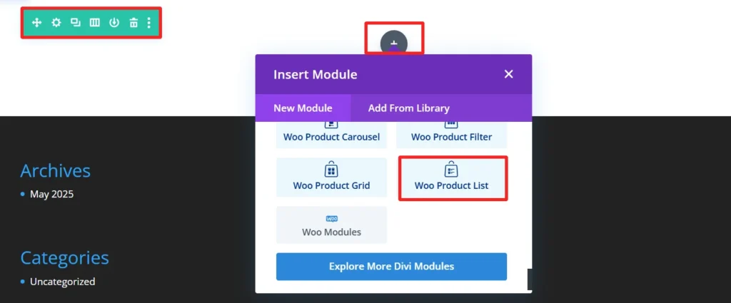
Add the Product List Module
- Select the gray + button on the row.
- Search for Product List.
- Choose the Product List Module.
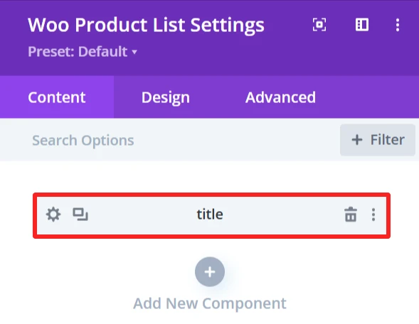
- Set the Product List Settings.
Child Components and Child Features #
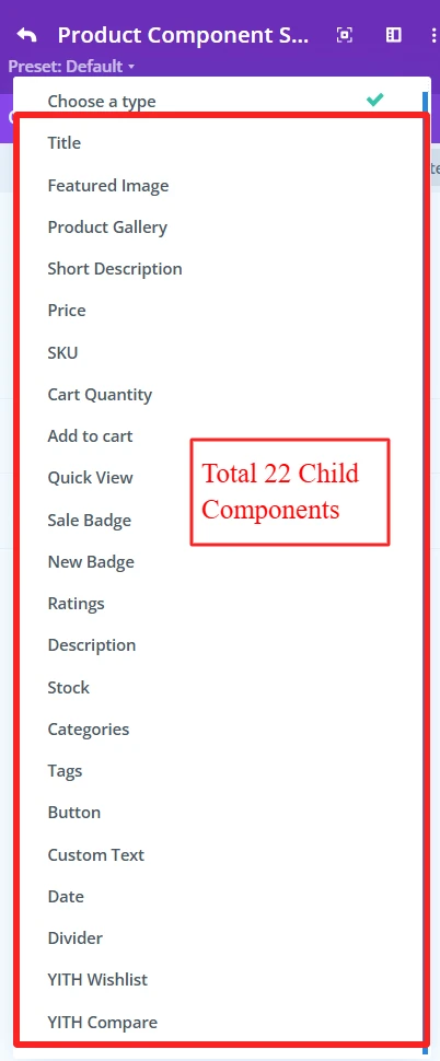
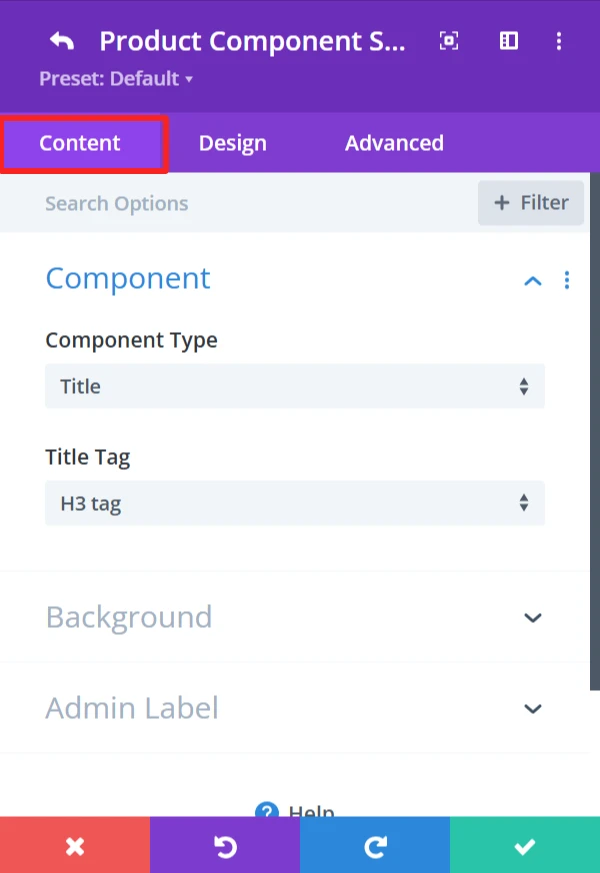
1. Product Title #
Purpose: Shows the name of the product in the list.
Content Tab: #
Select Title Tag for product (H1, H2, H3, etc.). Also, the background of the title can be changed using the background feature.
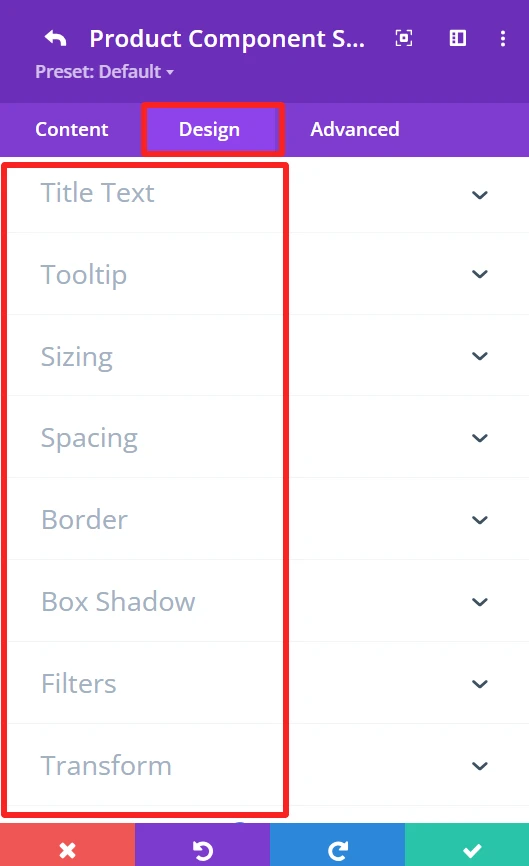
Design Tab: #
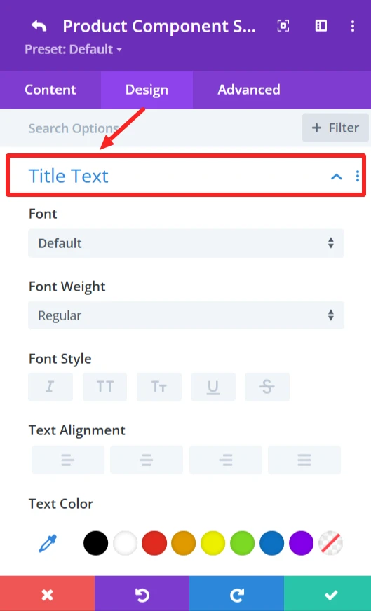
Configure the text settings such as font, size, color, letter spacing, line height, and text shadow.
General Styling: #
These features are available for each child component and work the same.
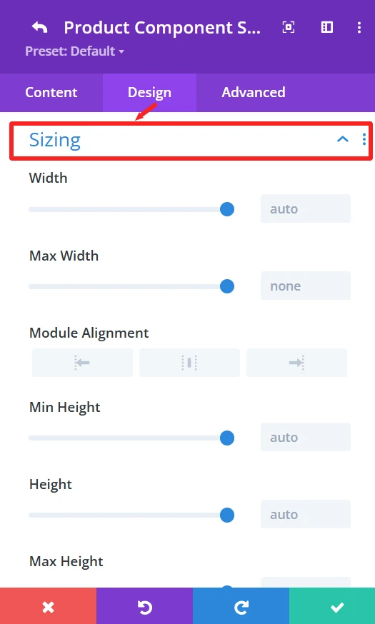
Sizing feature: Set width, height, and alignment.
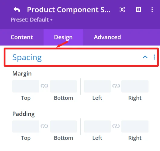
Spacing feature: Control Margin and padding system.
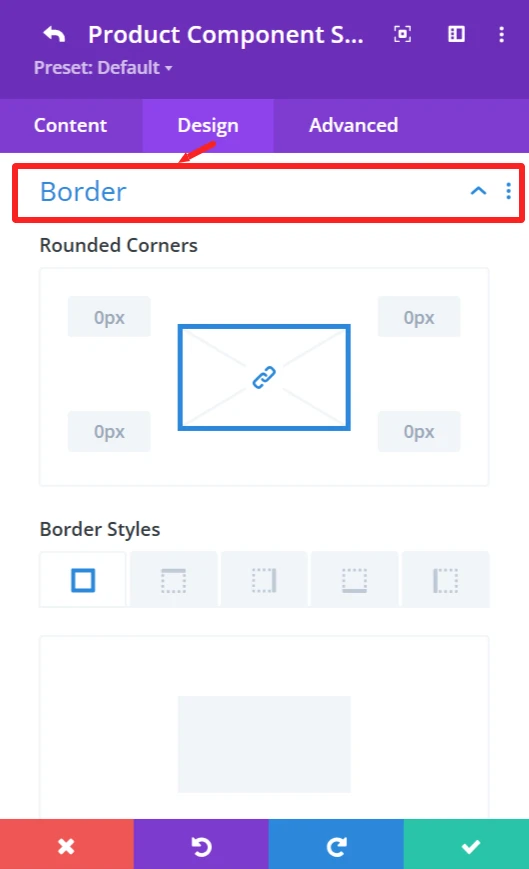
Border feature: Custom Border of the products list, like broader color, width, and styles, and rounded corners.
Box Shadow effects: Add shadow effects for depth.
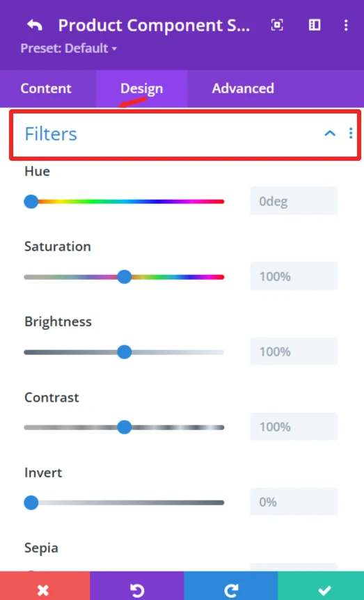
Filters feature: Apply filters like Hue, brightness, and opacity sliders.
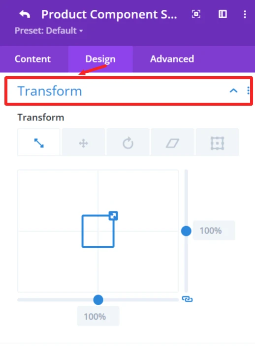
Transform feature: Use Transformations (scaling, rotation, etc.)for dynamic effects.
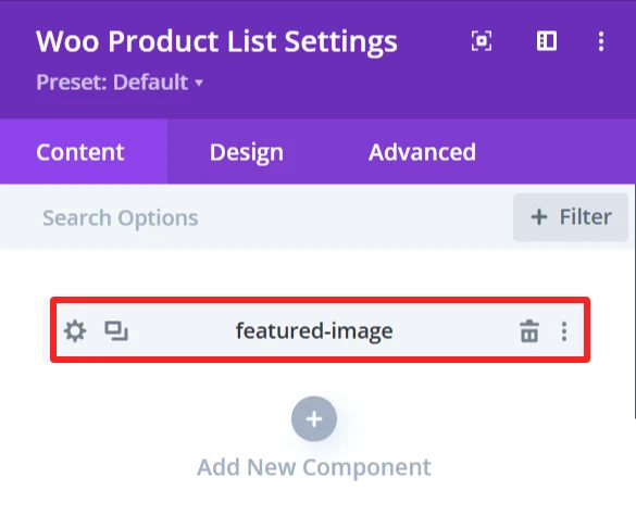
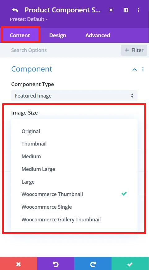
2. Featured Image #
Purpose: Shows the primary image of the product.
Content Tab: #
Image Size (small, medium, large, custom size). Also, the background of the featured-image can be changed using the background feature.
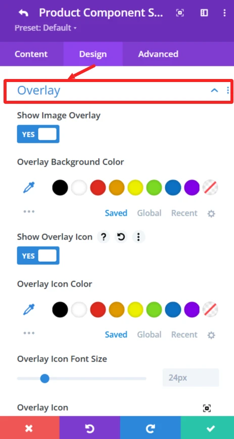
Design Tab: #
Overlay: Insert or delete image overlays, and modify the overlay’s background color.
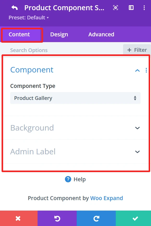
3. Product Gallery #
Purpose: Shows more product images in a gallery form.
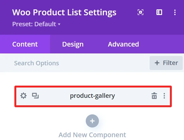
Content Tab: #
The Background of the product gallery can be changed using the background feature.
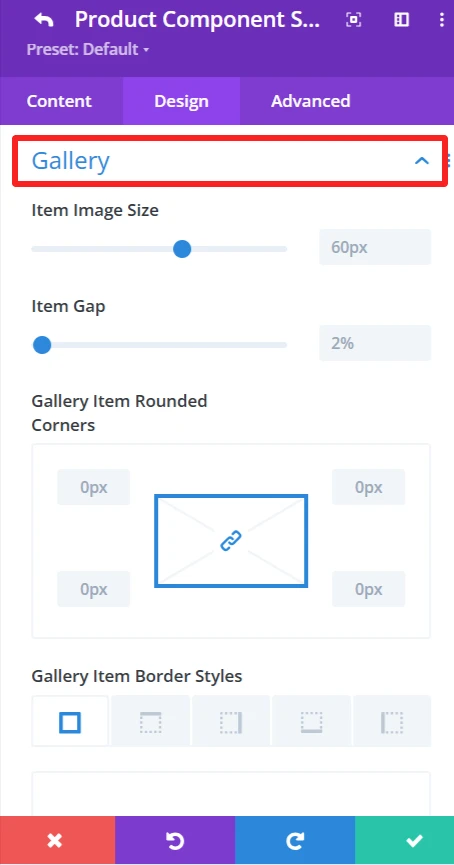
Design Tab: #
Gallery: Adjust picture size, gaps, and borders.
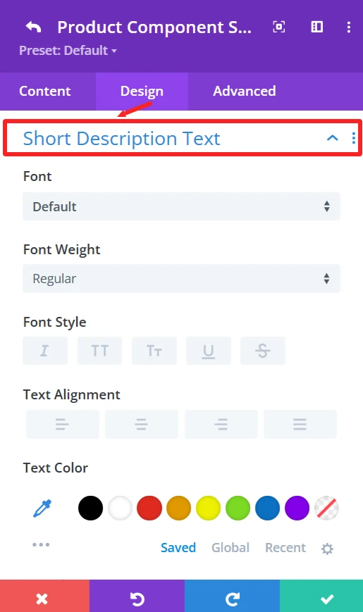
4. Short Description #
Purpose: Displays a brief product description.
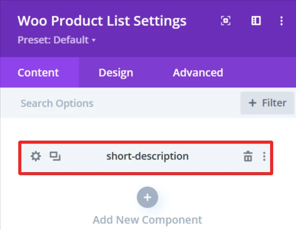
Content Tab: #
Option to Show the Brief Product Description.
Design Tab: #
Short Description Text: Set font size, text color, letter spacing, and text shadow.
5. Product Price #
Purpose: Shows the price of the product.
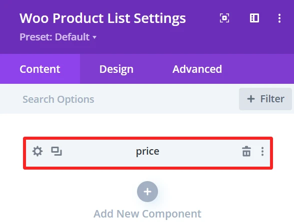
Content Tab: #
Select the Price Tag and Type (i.e., sale, regular price).
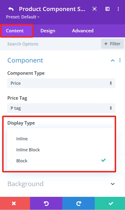
Display Type: Shows the display type of the price inline, Inline Block, or Block.Animation: Can select the animation type.
Design Tab: #
Price text: Set font size, text color, letter spacing, and text shadow of the price text.
6. SKU #
Purpose: Displays the product’s unique identification code (SKU).
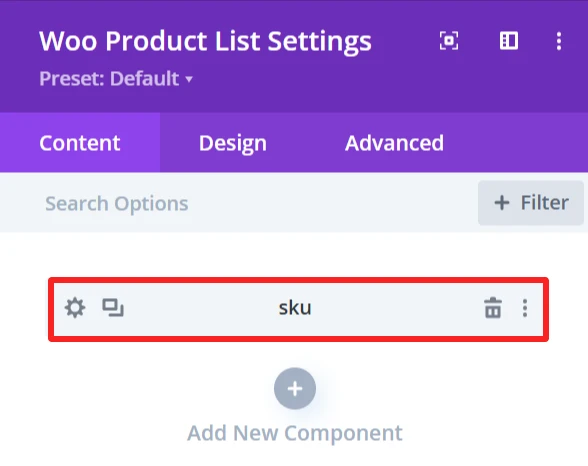
Content Tab: #
Select the Stock Keeping Unit (SKU).
This element also has the following options: Display Type (Inline\ Inline Block\ Block), Animation (apply animation effects), Background (custom background).
Design Tab: #
Component Text: Set font size, text color, letter spacing, and text shadow of the SKU text.
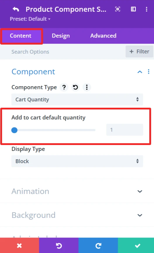
7. Cart Quantity #
Purpose: This is the input area to add several products in the cart.
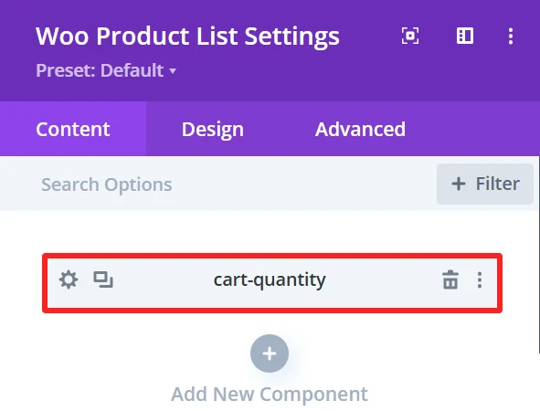
Content Tab: #
Show quantity field for adding multiple items to the cart.
This element also has the following options: Display Type (Inline\ Inline Block\ Block), Animation (apply animation effects), Background (custom background).
Design Tab: #
Component Text: Edit text like “Quantity”.
Cart Quantity: Control the color and background of the cart quantity input field.
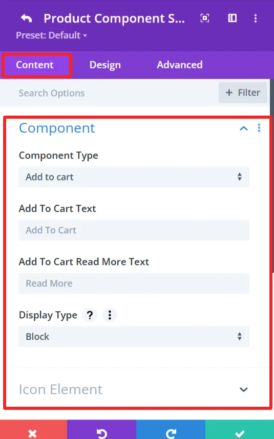
8. Add to Cart button #
Purpose: Display a button to add products in the shopping cart.
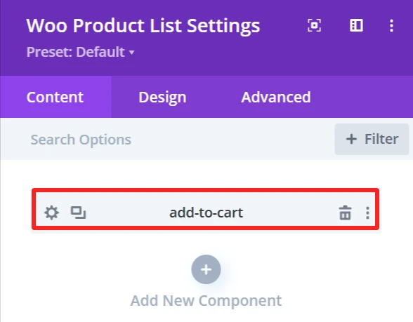
Content Tab: #
This will include the button that adds the product to the cart.
Add to cart text: Customize the text that appears on the button (i.e., buy now or purchase now).
Add to cart read more text: Set alternative text for detailed product view if needed.
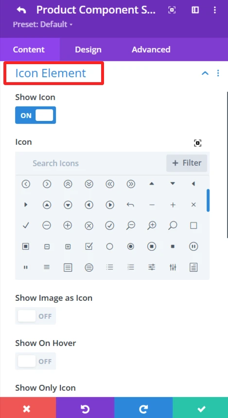
Icon Element: The Icon Element provides the ability to customize and show icon with the add to cart text.
Show Icon: Enable or disable the icon display next to the button text.
Icon: Select an icon from the icon’s list.
Show Image as Icon: Replace the icon with a custom image.
Show On Hover: Display the icon/image when the user hovers.
Show Only Icon: Only shows the icon without any text.
Icon Placement: specify the icon location (left or right);
Space Between Component and Icon: set the space between button text and icon/image.
This element also has the following options: Display Type (Inline\ Inline Block\ Block), Animation (apply animation effects), Background (custom background).
Design Tab: #
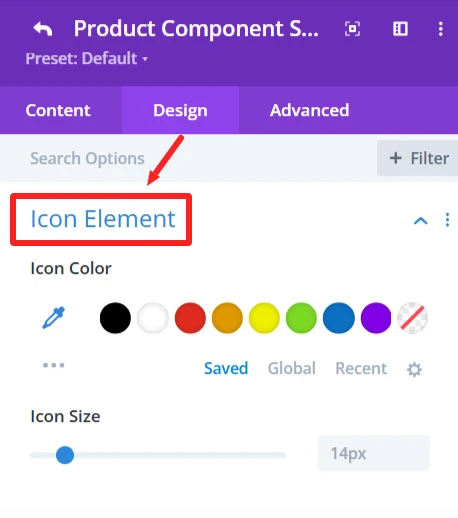
Icon Element: Add icon color and customize size.
Add to Cart Text: Set font size, text color, letter spacing, and text shadow of the add to cart text.
9. Quick View #
Purpose: Open a preview of the product in a popup.
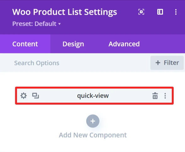
Content Tab: #
Icon Element: The Icon Element provides the ability to customize and show icon with the quick view text.
Show Icon: Enable or disable the icon display next to the text.
Icon: Select an icon from the list.
Show Image as Icon: Replace the icon with a custom image.
Show On Hover: Display the icon/image when the user hovers.
Show Only Icon: Only shows the icon without any text.
Icon Placement: specify the icon location (left or right);
Space Between Component and Icon: set the space between text and icon/image.
This element also has the following options: Display Type (Inline\ Inline Block\ Block), Animation (apply animation effects), Background (custom background).
Design Tab: #
Quick View Text: Ability to set font size and style of quick view text.
Icon Element: Add icon color and size
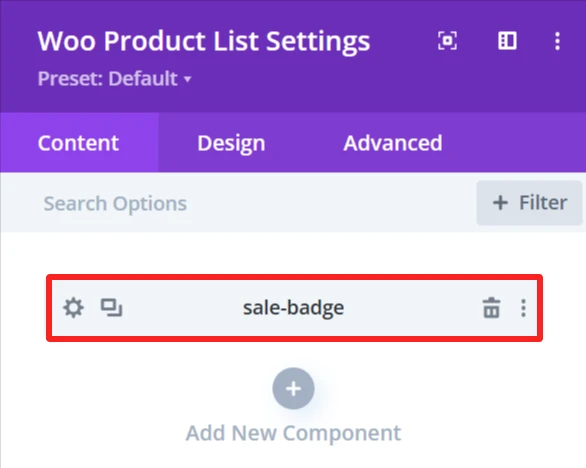
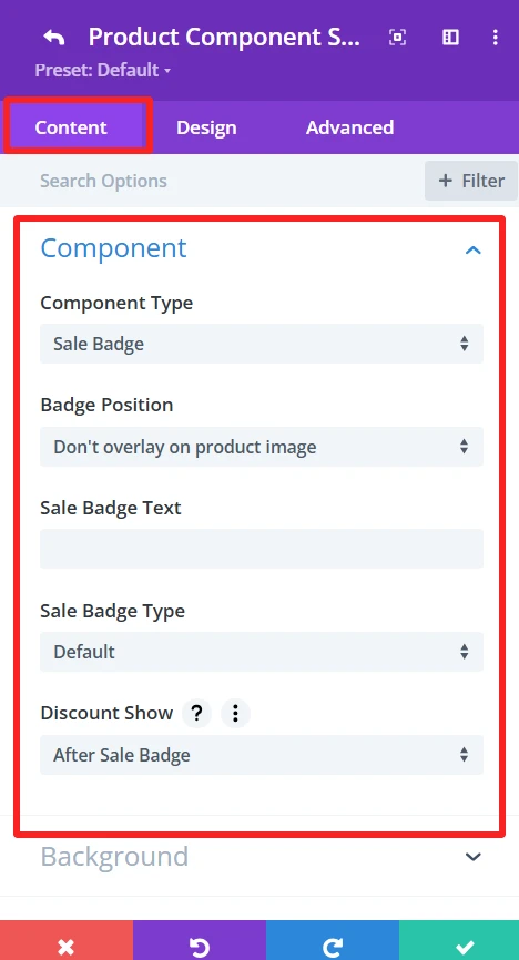
10. Sale Badge #
Purpose: Displays a label to indicate the product is on sale.
Content Tab #
Component Type: Choose Yes or set the component type to “Sale Badge” to make the badge functional.
Badge Position: Select the badge position in relation to the product image.
Sale Badge Text: Enter the text to show up in the sale badge (e.g., “Sale,” “Discount,” etc.).
Sale Badge Type: Choose the sale badge type that will be shown (e.g., “percentage,” “flat Amount,” etc.).
Discount Show: Select when the discount should show up compared to the sales badge ( after sale badge or before sale badge)
Design Tab: #
Badge Text: Set font size and style of sale batch text.
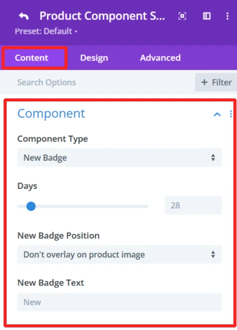
11. New Badge #
Purpose: Displays a label to indicate the product is new.
Content Tab #
Component Type: Choose Yes or Set the component type to “New Badge” to make the badge functional.
Days: Use the slide to configure the number of days for which the product is considered new. This sets the duration the ”New” badge will be displayed according to the product release date.
Badge Position: Select badge position in relation to the product image.
New Badge Text: Enter the text to show up in the new badge (e.g., “New,” “Just Arrived,” etc.).
Design Tab: #
Component Text: Set font size and style of the new batch text.
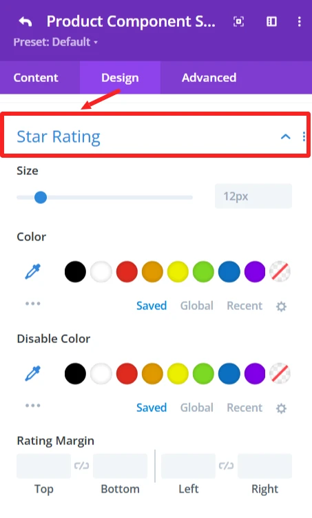
12. Ratings #
Purpose: Shows product ratings from customer reviews.
Content Tab: #
This element also has the following options: Display Type (Inline\ Inline Block\ Block), Animation (apply animation effects), Background (custom background).
Design Tab: #
Star Rating: Specify size, color, and margin for stars.
13. Description #
Purpose: Shows the product’s entire description.
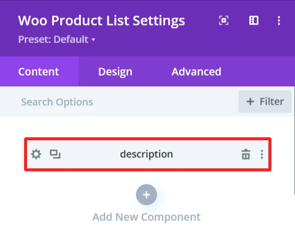
Content Tab: #
Describe the product in full.
Design Tab: #
Description Text: Change the font, size, color, and add a shadow to the text.
14. Stock #
Purpose: Show availability of product (in stock/out of stock).
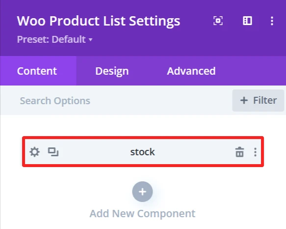
Content Tab #
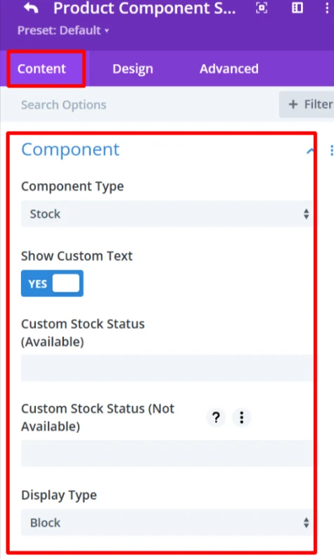
Component Type: Set component as “Stock” to show stock status of the product, whether available or not.
Show Custom Text: Check this to show custom text for the stock status (custom text in a new section to have more control of the appearance).
Custom Stock Status (In Stock Message): This is the text that will display when the product is in stock, for example, “In stock” or “Available”.
Custom Stock Status (Unavailable): As for the product status when out of stock (e.g., Out of Stock, Unavailable), the user can also customize the text as needed.
This element also has the following options: Display Type (Inline\ Inline Block\ Block), Animation (apply animation effects), Background (custom background).
Design Tab: #
Component Text: Change the font, size, color, and add a shadow to the text.
15. Categories #
Purpose: Shows product categories.
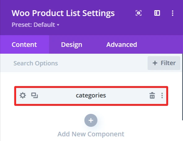
Content Tab: #
This element also has the following options: Display Type (Inline\ Inline Block\ Block), Animation (you can choose a type of animation to apply effects) Background (you can configure a custom background using this feature).
Design Tab: #
Categories Text: Set the font, size, and color of category names.
16. Tags #
Purpose: Shows tags of products.
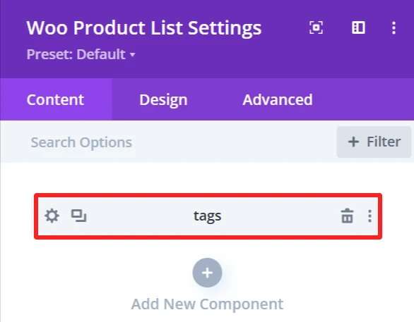
Content Tab: #
#
Product tags are visible here.
This element also has the following options: Display Type (Inline\ Inline Block\ Block), Animation (apply animation effects), Background (custom background).
Design Tab: #
Tags Text: Customize the product tags text.
17. Button #
Purpose: Add a button which can be set to link to any URL (i.e., a product page).
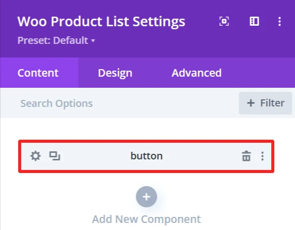
Content Tab: #
Adds a button with an external link option.
Button Text: Change button’s text
Icon Element: The Icon Element provides the ability to customize and show icon with the button text.
Show Icon: Enable or disable the icon display next to the button text.
Icon: Select an icon from the icon’s list.
Show Image as Icon: Replace the icon with a custom image.
Show On Hover: Display the icon/image when the user hovers.
Show Only Icon: Only shows the icon without any text.
Icon Placement: specify the icon location (left or right);
Space Between Component and Icon: set the space between button text and icon/image.
This element also has the following options: Display Type (Inline\ Inline Block\ Block), Animation (apply animation effects), Background (custom background).
Design Tab: #
Button Text: Set button’s text font, size, and color.
Icon Element: Add icon color and size
18. Custom Text #
Purpose: Add a custom text under the product.
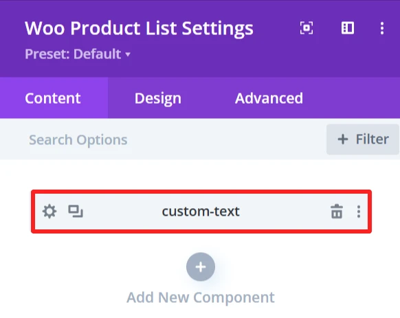
Content Tab #
Text: field to add personalized text under the product.
Icon Element: The Icon Element provides the ability to customize and show icon with the custom text.
Show Icon: Enable or disable the icon display next to the text.
Icon: Select an icon from the icon’s list.
Show Image as Icon: Replace the icon with a custom image.
Show On Hover: Display the icon/image when the user hovers.
Show Only Icon: Only shows the icon without any text.
Icon Placement: specify the icon location (left or right);
Space Between Component and Icon: set the space between text and icon/image.
This element also has the following options: Display Type (Inline\ Inline Block\ Block), Animation (apply animation effects), Background (custom background).
Design Tab: #
Component Text: Set custom text font, size, and color.
Icon Element: Add icon color and size
19. Date #
Purpose: Shows the date when the product was published or modified.
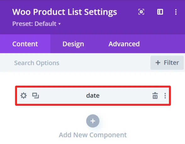
Content Tab: #
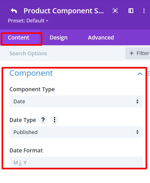
Date type: Shows the published or modified date of the product.
Date Format: Can select the date format.
Design Tab: #
Component Text: date text’s font, size, and alignment can be modified.
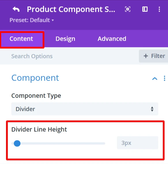
20. Divider #
Purpose: Inserts a line between blocks.
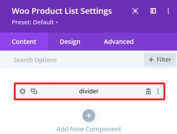
Content Tab: #
Divider Line Height: Slider used to customize the line size.
Design Tab: #
Divider line: Change the Color, Color direction starting and ending position of the divider.
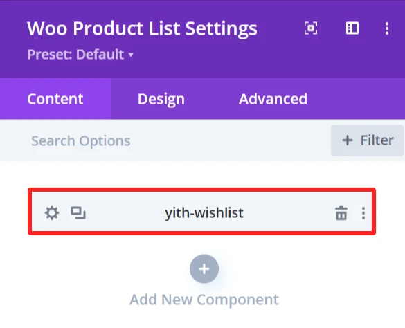
21. YITH Wishlist #
In order to use YITH WooCommerce Wishlist, users need to install YITH WooCommerce Wishlist plugin.
Purpose: Enables product Wishlist functionality.
Content Tab: #
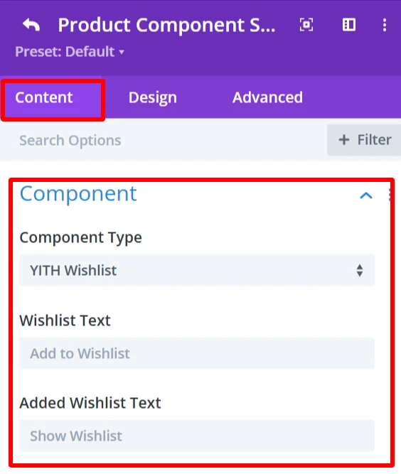
Wishlist Text: Add to Wishlist: The text that will be displayed on the Wishlist button. User can edit this text (e.g., ”Save for later” or “Favorite”).
Added Wishlist Text: This is the text to be shown when the product is already in the Wishlist. It means the product is added to wishlist and clicking on it will take user to wishlist page.
Icon Element: The Icon Element provides the ability to customize and show icon with the wishlist text.
Show Icon: Enable or disable the icon display next to the wishlist text.
Icon: Select an icon from the icon’s list.
Show Image as Icon: Replace the icon with a custom image.
Show On Hover: Display the icon/image when the user hovers.
Show Only Icon: Only shows the icon without any text.
Icon Placement: specify the icon location (left or right);
Space Between Component and Icon: set the space between text and icon/image.
This element also has the following options: Display Type (Inline\ Inline Block\ Block), Animation (apply animation effects), Background (custom background).
Design Tab: #
Component Text: Customize the Wishlist button text.
Icon Element: Add icon color and size
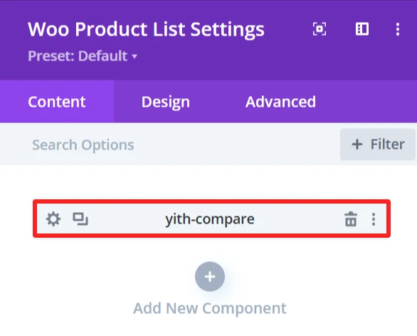
22. YITH Compare #
In order to use YITH WooCommerce Compare, users need to install YITH WooCommerce Compare plugin.
Purpose: Allows customers to compare different products.
Content Tab: #
Compare Text: Set the text for the compare button.
Icon Element: The Icon Element provides the ability to customize and show an icon with the compare text.
Show Icon: Enable or disable the icon display next to the compare text.
Icon: Select an icon from the list.
Show Image as Icon: Replace the icon with a custom image.
Show On Hover: Display the icon/image when the user hovers.
Show Only Icon: Only shows the icon without any text.
Icon Placement: specify the icon location (left or right);
Space Between Component and Icon: set the space between text and icon/image.
This element also has the following options: Display Type (Inline\ Inline Block\ Block), Animation (apply animation effects), Background (custom background).
Design Tab: #
Component Text: Customize the compare button text.
Icon Element: Add icon color and size
Global Features Of Woo Product List Settings #
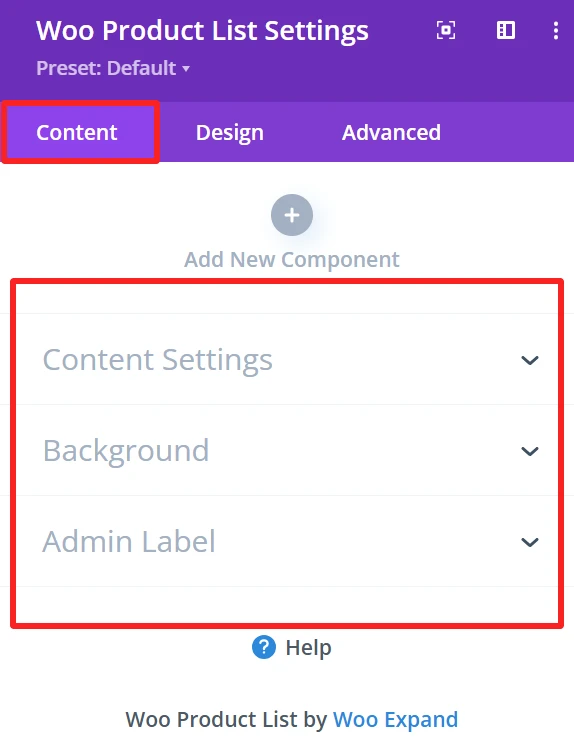
Content Tab – Woo Product List Settings #
The content tab offers an extensive amount of options to control how products are displayed in the product list. This section is made to be customizable in layout and sorting.
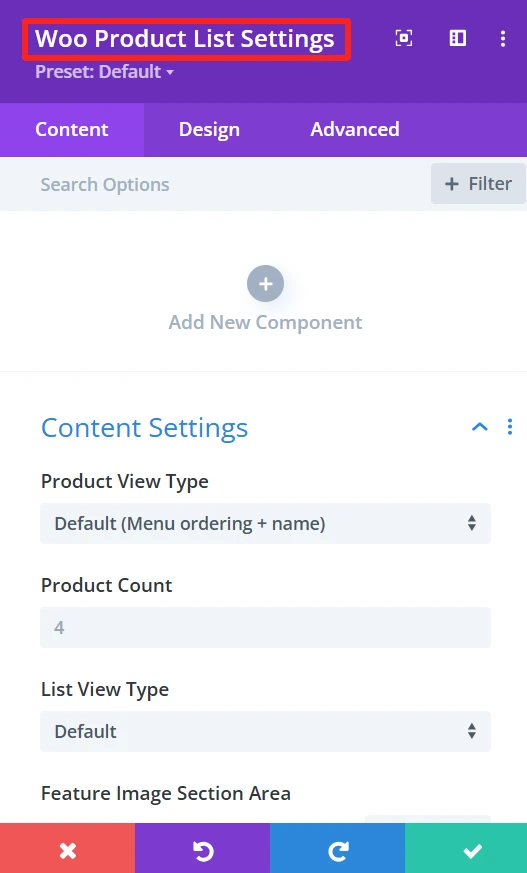
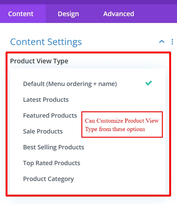
Content Setting → Product View Type #
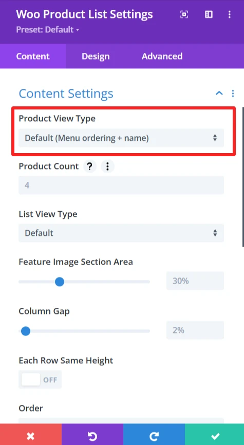
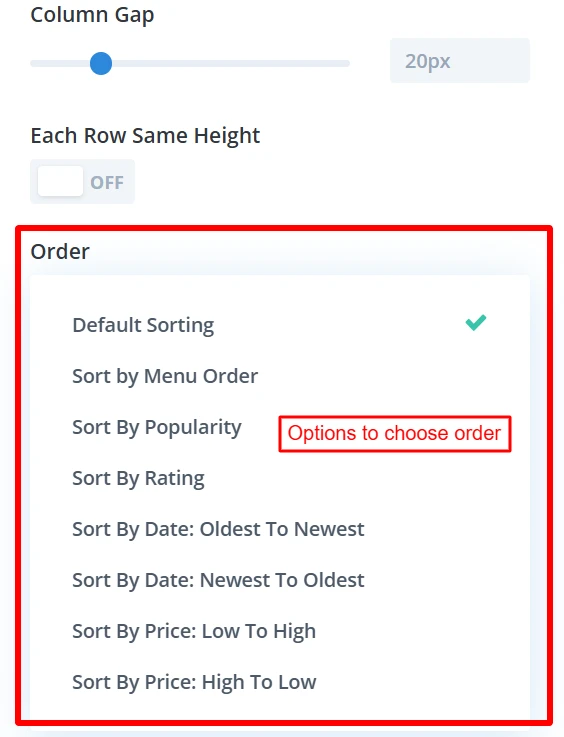
Functionality: This option sorts products based on different parameters like product name, custom menu order, etc.
Default Sorting: Menu order + name, which orders products by the menu order and the name.
Customization options: You can choose different ways to sort by bestselling products, by latest products, etc, to customize the format for your website.
Content Setting → Product Count #
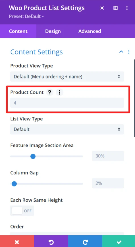
Functionality: This option lets you determine how many products are displayed for each page on the list.
Default Setting: The 4 products option displays 4 products per page.
Customization options: The value can be set according to personal preference.
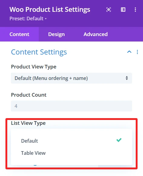
Content Setting → List View Type #
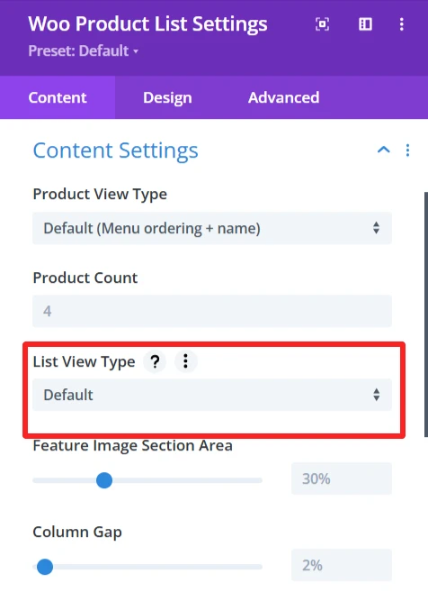
Functionality: This option will decide how the list of products will be displayed. It offers two types of views:
Default Setting: The standard view that shows products in a normal (list) way.
Table View: List the products in table format, which can be great for side by side comparisons.
Customization Options: It supports both ”Default” or “Table View”, so you could choose one, depending on your website design.
Content Setting → Feature Image Section Area #
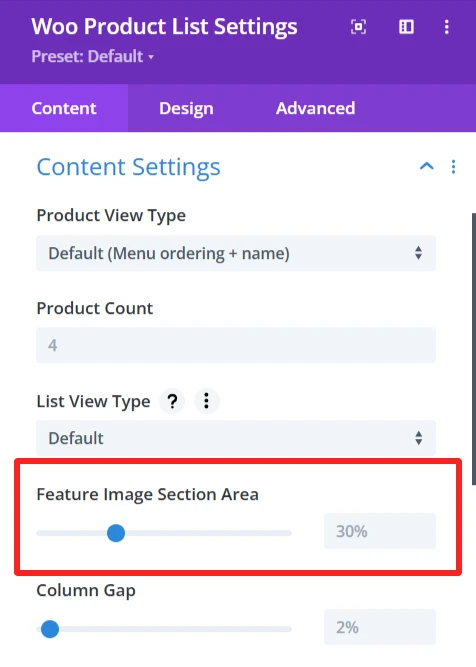
Functionality: This option changes the size of the feature image area that will be displayed with each product.
Default settings: 30% – This is a percentage to decide how much space the feature image will occupy in the product list.
Customization Options: The area dedicated to product images can be easily increased or decreased using the slider. That way, you can tailor the layout to better feature product images or shrink them down according to the design’s needs.
Content Setting → Column Gap #
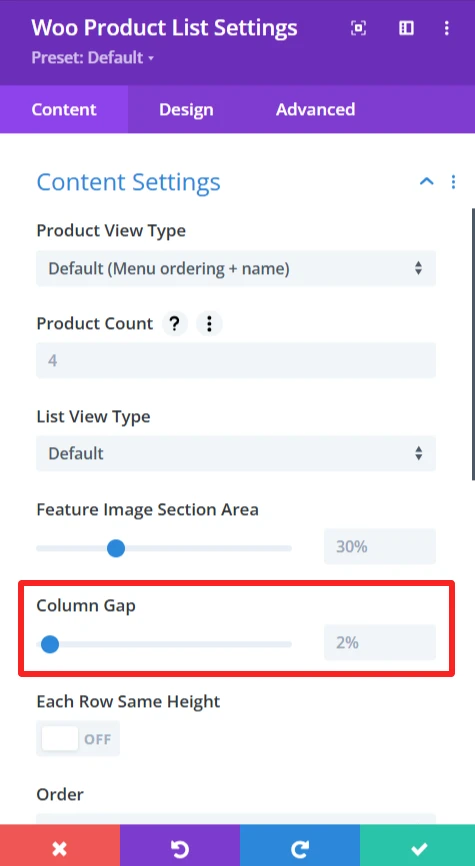
Functionality: column gap controls setting the space between product cards for better separation and a more organized layout.
Default Setting: 2%, a 2% space between columns.
Customization options: you can customize the gap by changing the value to make a larger or narrower space between columns, for example 10%.
Content Setting → Each Row Same Height #
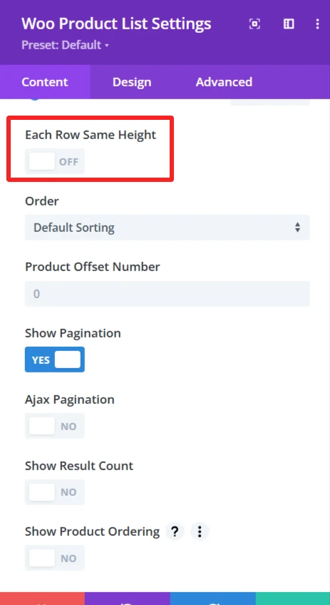
Functionality: When enabled, all the product items will have an equal height in the same row.
Content Setting → Order #
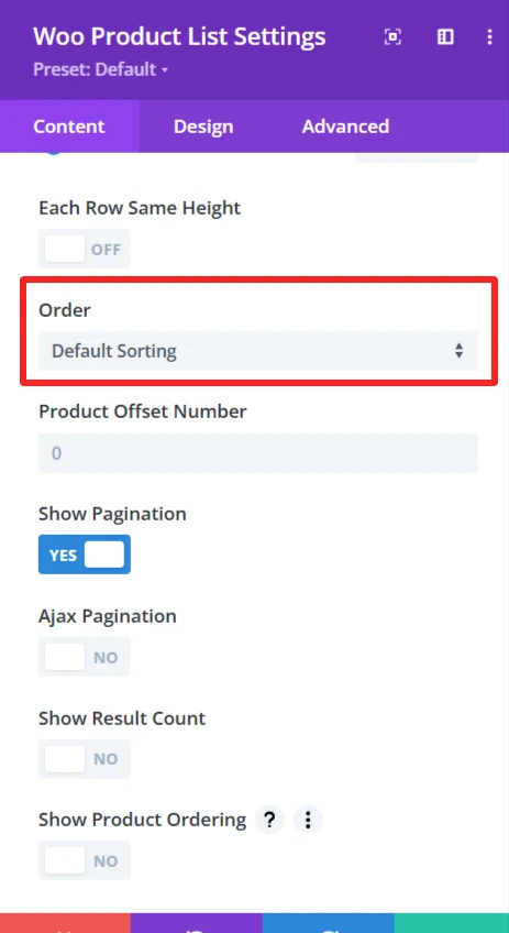
Functionality: This feature enables products to be shown based on one of several criteria, like sort by rating, sort by popularity, etc.
Customization options: Select how products are sorted, such as by rating, popularity, etc.
Content Setting → Product Offset Number #
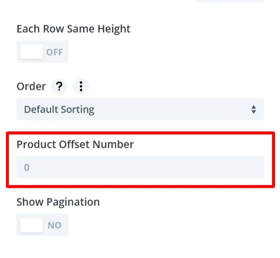
Functionality: Allows to skip few products from the beginning of the list. For instance, if you set the offset to 3, the first three products would not be displayed.
Default Setting: The default value is 0, which would start showing products on the list from the first one.Customization options: This offset can be customized to jump over any certain number of products and set the starting point of the list display.
Content Setting → Show Pagination #
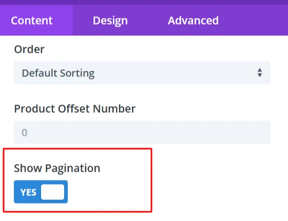
Functionality: Manage visibility of pagination in the product list. By using pagination, products are spread over several pages, but users can visit them via the page number
Customization options: you can choose to enable (YES) or disable (NO) pagination, so that all products load on one single page, with no additional pages required.
Content Setting → Show Result Count #
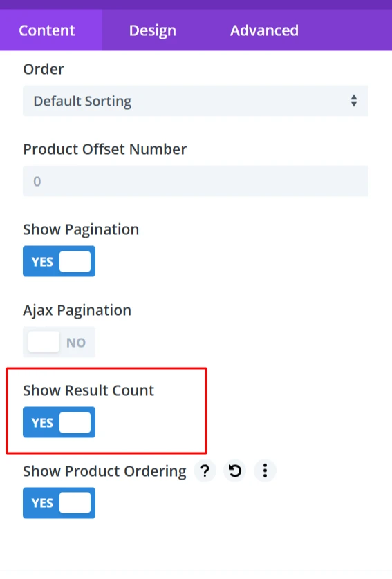
Functionality: Shows the count of the products that fit in the filter
Customization options: Customization of this setting (YES/NO) will show on top or bottom of the list.
Content Setting → Show Product Ordering #
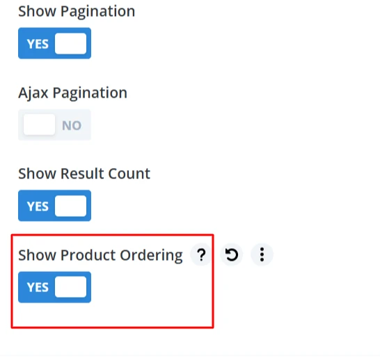
Functionality: Users can use this feature to sort the products displayed in the list. There can be sorting on the basis of price, popularity or date and users could have the facility to easily view products according to their choice.
Customization options: If NO, the dropdown or buttons used to order the product are hidden, and the user isn’t able to change the order in which the products are shown!
Background #
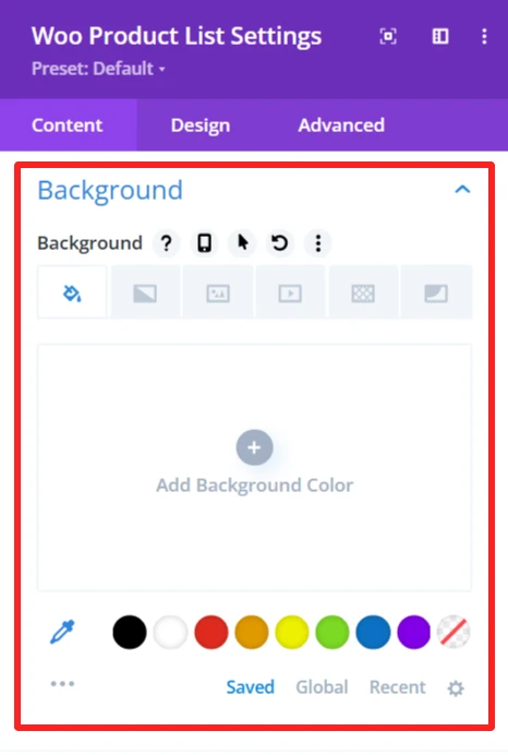
Customize the background display of the WooCommerce product list by setting a background color, image, or style. It allows you to customize the list design so that it fits on your website and matches your site’s look.
Admin Label #
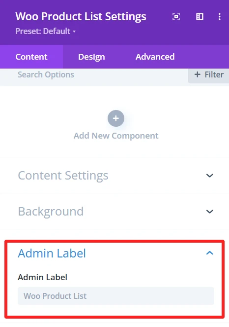
The Admin Label is suitable for locating/managing the product list in the WordPress admin panel. Administrators/developers can find/grab the list component faster than other elements.
Design Tab – Woo Product List Settings #
The Design tab in the Woo Product List module lets you customize how the product list appears on your site. You can adjust the look and feel of the list and its items.
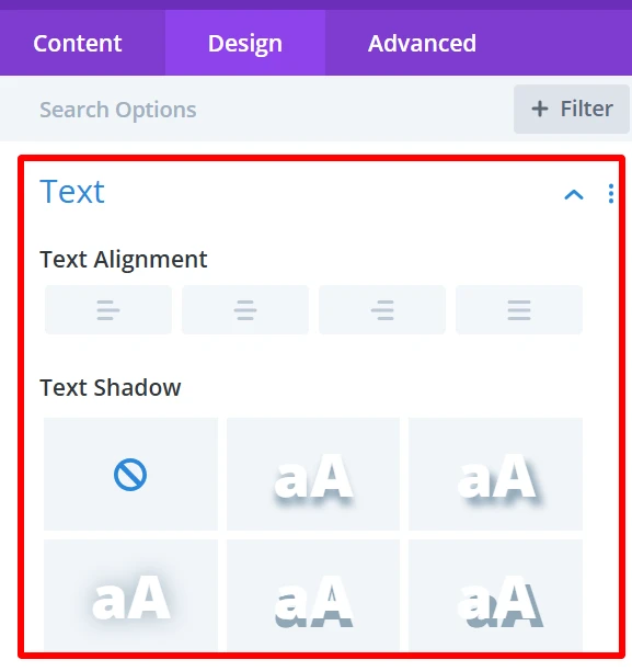
Text: It is used for customizing text alignment and text shadow within the list.
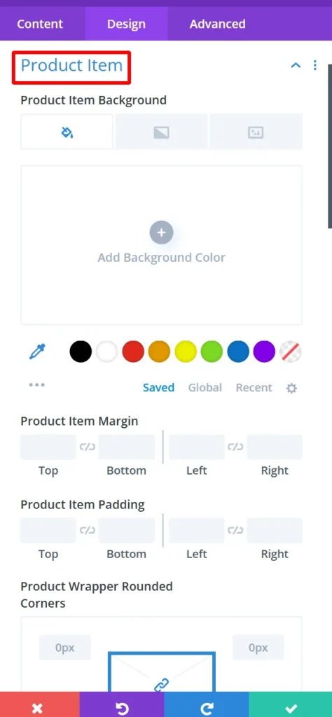
Product Item: It is used for customization product items’ background, margin, padding, product wrapper rounded corners, and its border style, width, color also used to give box shadow in product items.
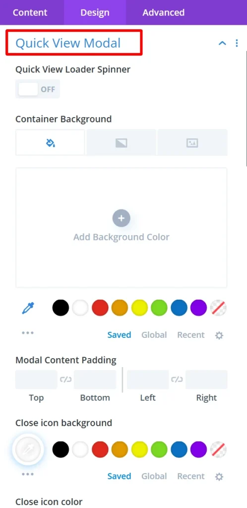
Quick View Modal: This is use to design how users will see a quick view popup in the event they click to view a product without leaving the page. You can style this modal however you really want to match your theme!
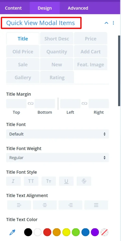
Quick View Modal Items: Set the items that are being displayed inside the quick view popup. You can display the product image, price, description, or any other optional information inside the modal.
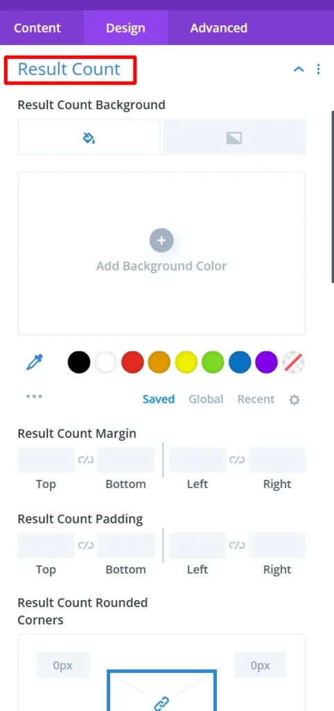
Result Count: it is used for customization of result count background, margin, padding, rounded corners, and its broader style, width, color also used to give box shadow in result count.
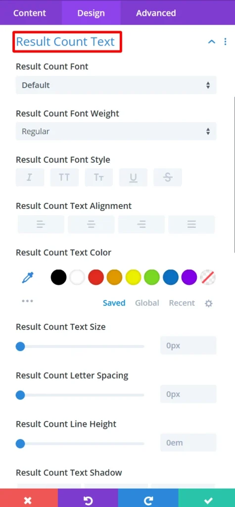
Result Count Text: This gives you the option to change the font, size, color and font style of the text used in the result count.
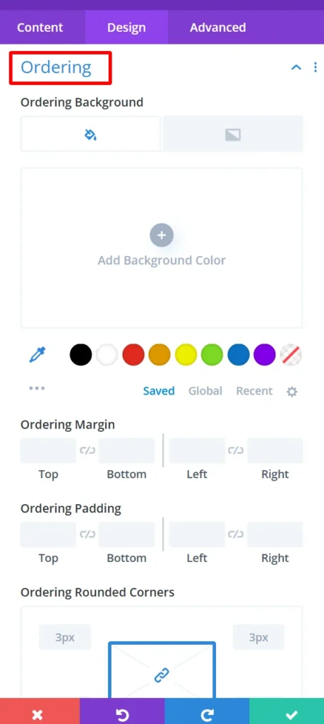
Ordering: it is used for customization of ordering background, margin, padding, rounded corners, and its broader style, width, color also used to give box shadow in ordering.
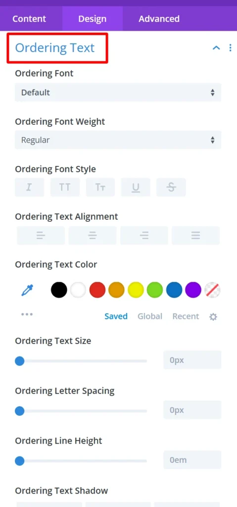
Ordering Text: You can use this option to change the font, size, color, and the style of the text used for ordering.
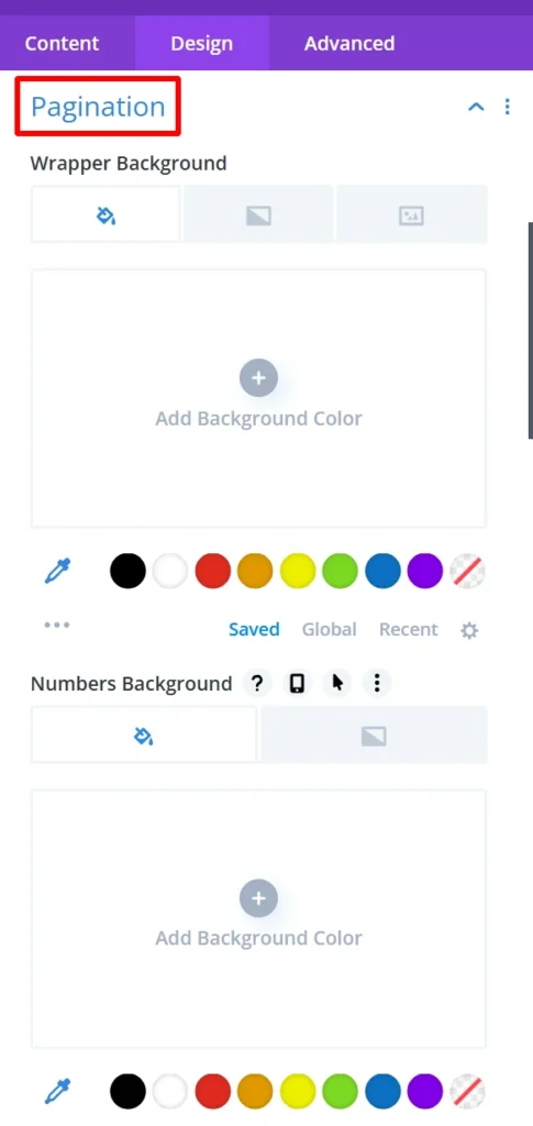
Pagination: it is used for customization of pagination wrapper background, number background margin, padding, rounded corners, and its broader style, width, color also used to give box shadow in pagination.
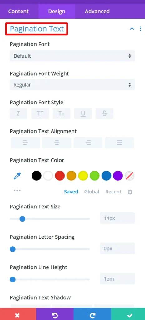
Pagination Text: Customize text (font, size, color, style) used in pagination.
Active Pagination: it is used for customization of active pagination number background, number margin, padding, rounded corners, and its broader style, width, color also used to give box shadow in active pagination.
Active Pagination Text: Customize the text to display on the active pagination button. This will be able to be adjusted to match your site’s style.
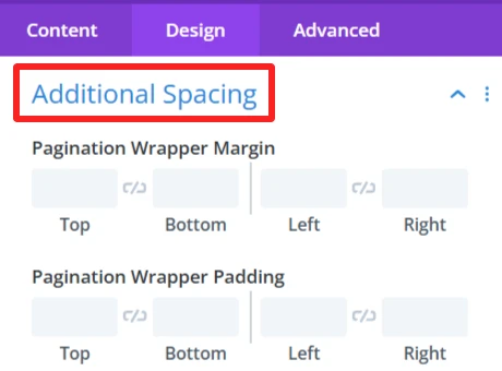
Additional Spacing: This is use to give full control of the margin and padding in your pagination wrapper. which improves the look and balance of the product list.
Sizing: This is where you control the size of your entire product list and your individual product items. You can make the items display in the list as big or small as you want.
Spacing: Changes the distance between the product items. You can close in or spread the gap between products for a tighter or more spread-out look.
Border: Allows you to put borders around the whole product list or single product items. This serves to visually distinguish the items from the background and other items.
Box Shadow: Allows you to apply a shadow around the product list. It adds a feeling of depth and makes the pieces pop a bit more.
Filters Effect: Hue, brightness, and opacity sliders to make the list more appealing.
Transform: You can rotate and scale the list or items. These effects can be a good way to add some interactive effects or visible flare to the list.
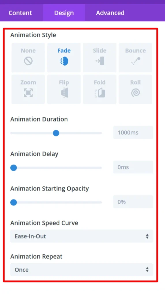
Animation: Intermittent animations when the user interacts with the product list. For instance, products could fade in or slide in from the side when the page is loaded or when users hover over them.
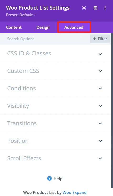
Advance Tab – Woo Product List Settings #
The Advanced section of the Woo Product list module offers more customization for those who’d like to have more control over the behaviour and visibility of the product list, as well as how the user will interact with it. These are mostly for those who know a bit of web development or who want to make fine-tuned adjustments. It offers options such as adding CSS IDs or classes, using its own custom CSS for design adjustments, and setting conditions for when the list is displayed.