Divi WooCommerce Category Carousel Module displays WooCommerce categories in a beautiful carousel slider. It includes plenty of settings to display your WooCommerce product categories as you prefer. With this module, you have the opportunity to create the design you want and showcase your product categories in various ways.
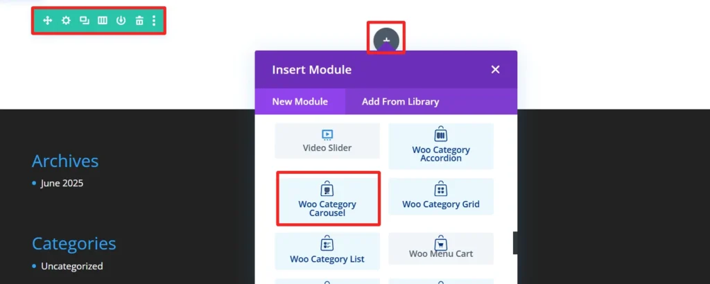
Adding the Category Carousel Module #
Add a New Section and Row
- Navigate to the visual builder of a page
- Tap the + (plus sign) to start a new section.
- Choose a Regular Section.
- Click the + within section to insert a row.
- Choose your column configuration (e.g., 1, 2).
Add the Category Carousel Module
- Select the gray + button on the row.
- Search for Category Carousel.
- Choose the Category Carousel Module.
- Set the Category Carousel Settings.
Child Components and Child Features #
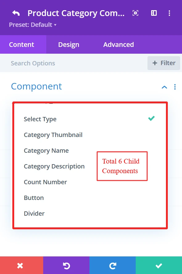
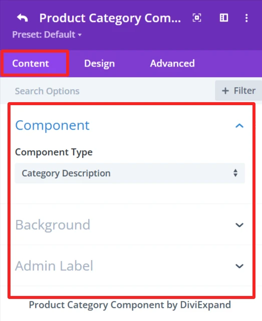
1. Category Thumbnail #
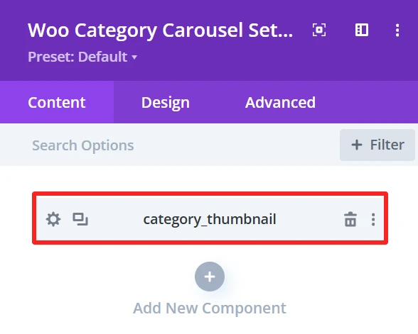
Purpose: Show the product category images as thumbnails.
Content Tab: #
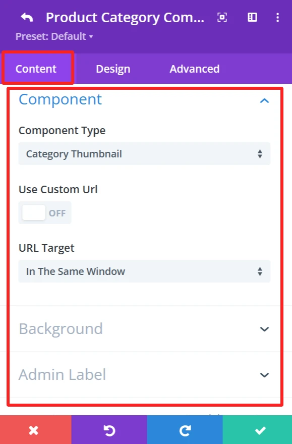
Component Type: This feature is available for each child component and works the same.
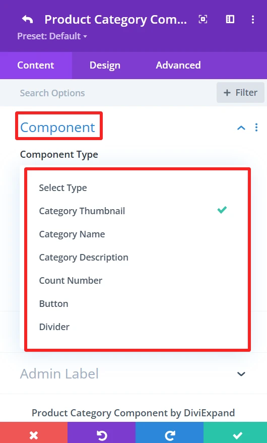
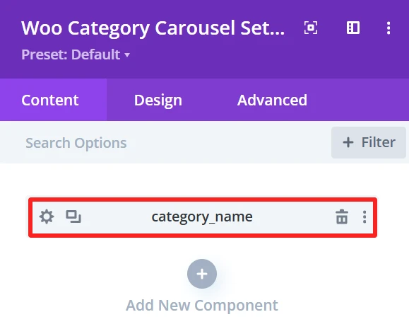
The “Component Type” dropdown prompts you to select the component to be the carousel item. You can select component type from the available options, including Category Thumbnail, Category name, Category description, etc.
Use Custom URL:
This feature lets you enter a custom category link. If checked, the URL will go to the supplied destination.
URL Target:
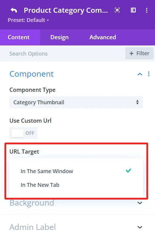
You can choose “In The Same Window” or “In The New Tab” as the URL Target. This is where the link will be opened upon clicking.
Background (This feature is available in the content tab of all child components and works the same.)
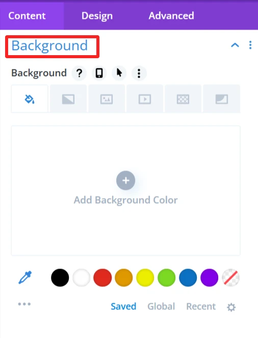
Here, you can choose the background settings of the category thumbnail, like the background color, background image, etc.
Admin Label (This feature is available in the content tab of all child components and works the same.)
With this, you can enter a custom label for your components, making it easy to label your layout if you are using more than one component.
Design Tab: #
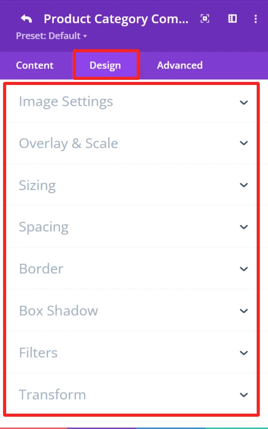
Image Settings:
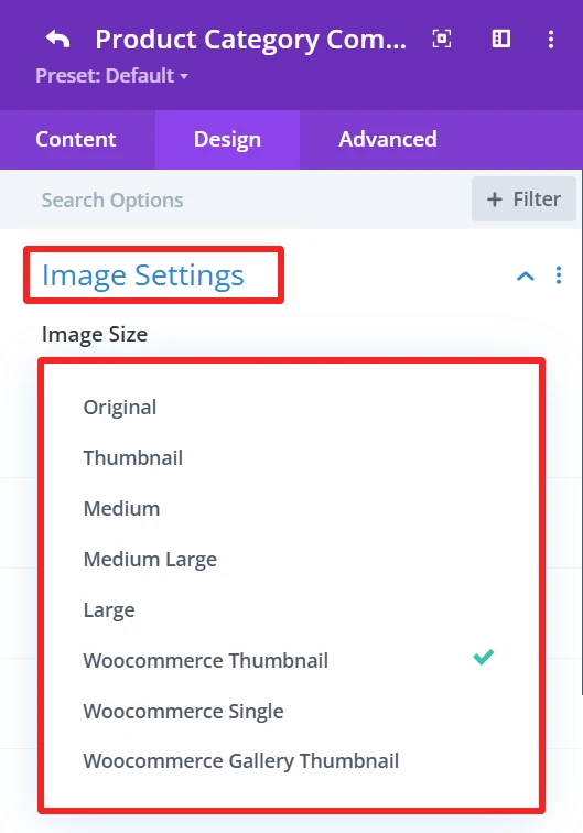
This section allows you to set how you would like your category image to be displayed. You have the option to specify the image size and other related settings to fit the thumbnail as you need.
Overlay & Scale:
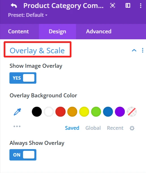
Modify the decoration that overlays the category thumbnail. You can also apply an overlay background color.
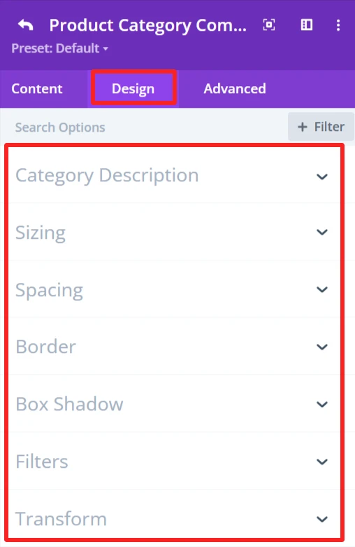
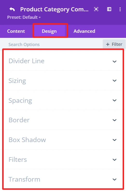
General Styling: #
These features are available for each child component and work the same.
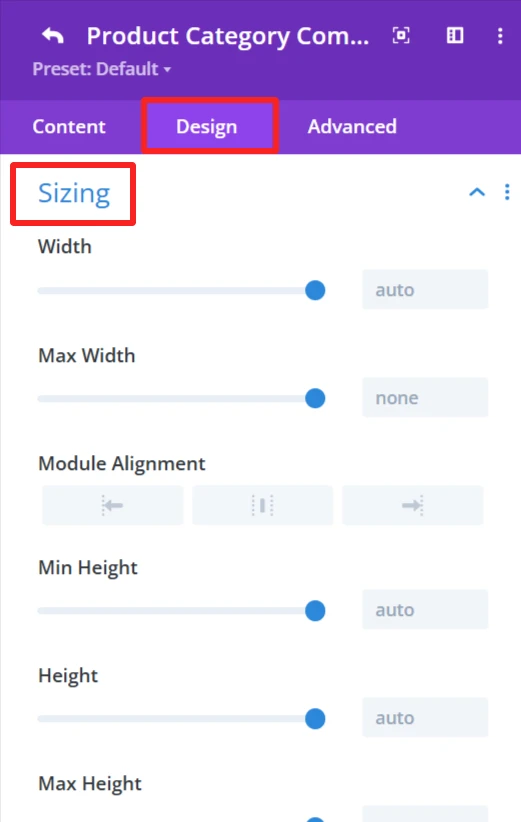
Sizing feature: Set width, height, and alignment.
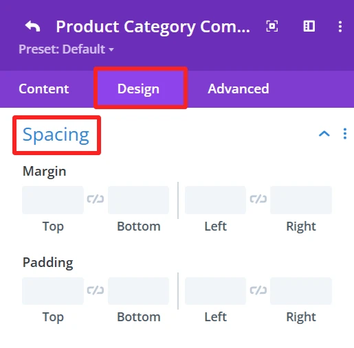
Spacing feature: Control Margin and padding system.
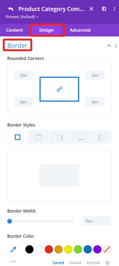
Border feature: Custom Border of the category carousel, like broader color, width, and styles, and rounded corners.
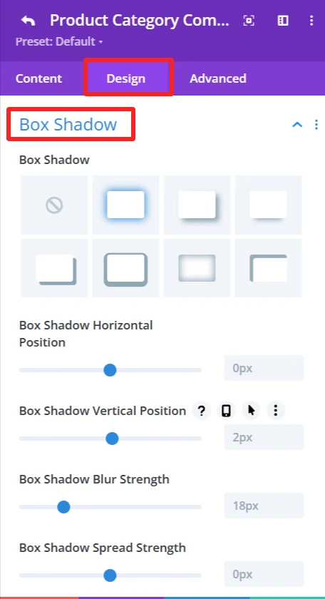
Box Shadow effects: Add shadow effects for depth.
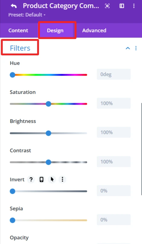
Filters feature: Apply filters like hue, brightness, and opacity sliders.
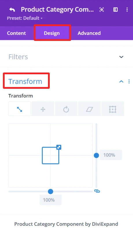
Transform feature: Use Transformations (scaling, rotation, etc.)for dynamic effects.
2. Category Name #
Purpose: Show the name of each of the product categories in the category carousel.
Content Tab: #
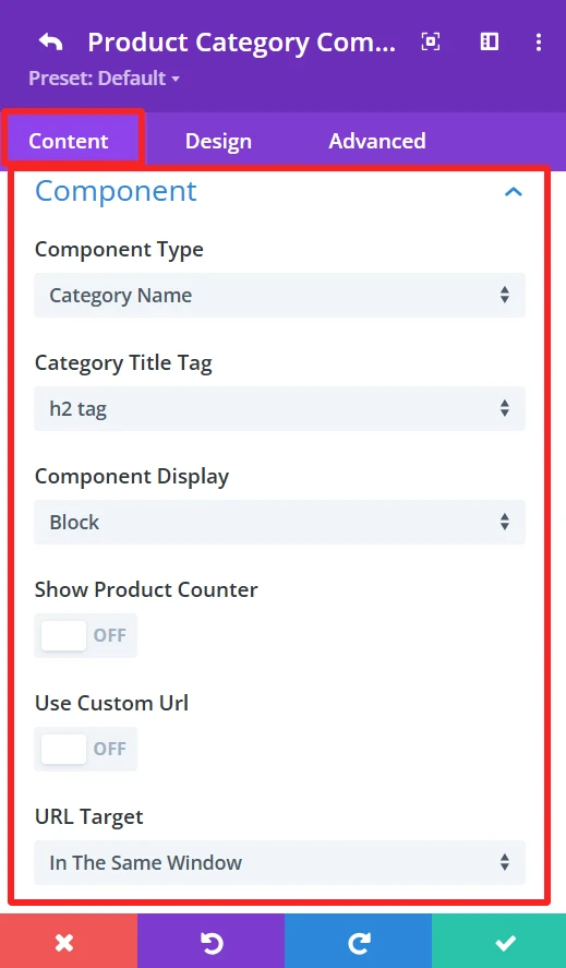
Category Title Tag:
This option allows you to select the HTML tag for the category name. Choices exist for tags such as h2, h3, or h4, which assist with all the Search Engine Optimization.
Component Display: (This feature is also available in the content tab of Counter Number and Button child components.)
You have control over the component view. It is Block by default, but you can change it to other display options (inline and inline block) according to what you want to achieve in design.
Show Product Counter:
This toggles the ability to display how many products are available within each category directly next to the category title. If disabled, only the category title is shown.
Design Tab: #
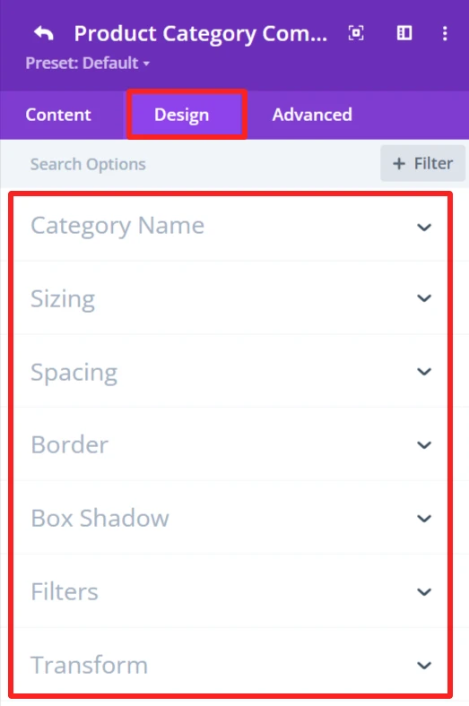
Category Name:
This gives you the option to style the category name, such as font size, colour, and weight.
3. Category Description #
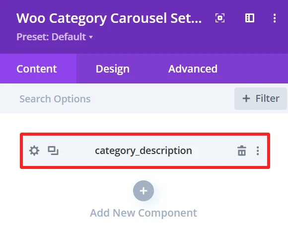
Purpose: Show the short description of each product category in the category carousel.
Content Tab: #
Design Tab: #
Category Description:
Set the typography options for the category description like font size, color, and weight.
4. Counter Number #
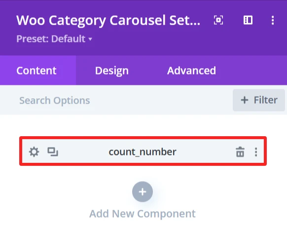
Purpose: Shows the count of products or items in a specific category.
Content Tab: #
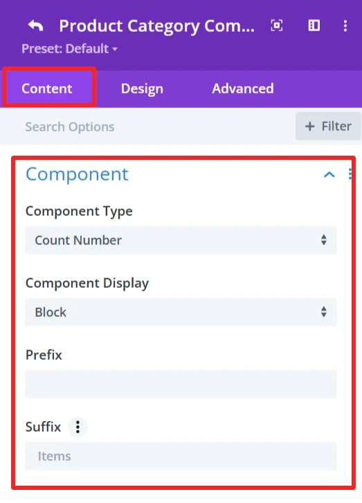
Prefix
Here you can add a prefix to the counter number. Empty means no prefix is placed before the counter number.
Suffix:
The suffix is ‘Items’, which will appear after the counter number.
Design Tab: #
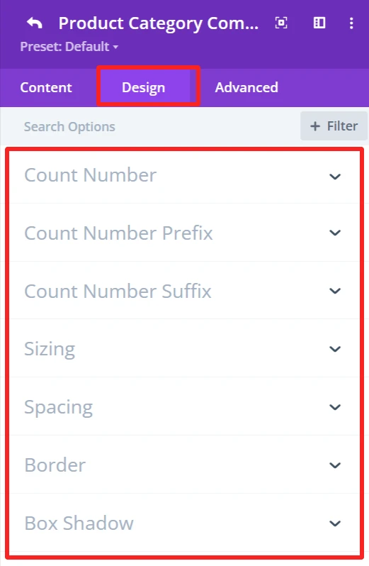
Count Number:
Customize the count number font size, weight, color, etc.
Count Number Prefix:
Formats the prefix design of the number, font size, weight, color, etc.
Count Number Suffix:
Customize the look for the suffix “Items”, font size, weight, color, etc.
5. Button #
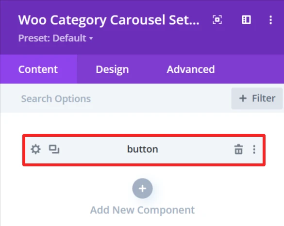
Purpose: Add a customizable button to a carousel that can be linked to a page or a category.
Content Tab: #
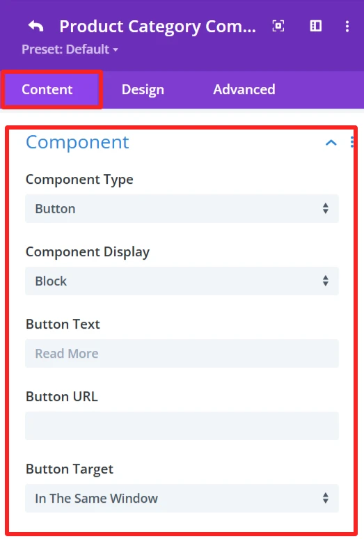
Component:
Button Text:
Determines the text to display in the button. Such as “Read More” or any Custom Text.
Button URL:
URL for the button to point to. This could be a link to a category, page, or other type of URL.
Button Target:
Select the button link target. Options include:
In The Same Window – Opens the link in the same tab.
“In The New Tab” – Opens the link in a new tab
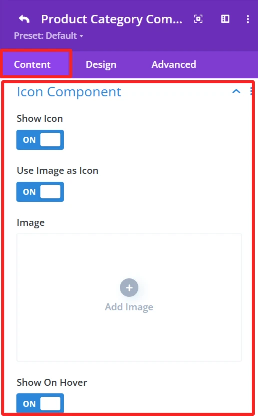
Icon Component:
Show Icon:
This option lets you choose whether or not you want an icon to appear alongside the category button.
Use Image As Icon:
This would allow you to use an image as the icon.
Image:
When you switch to “Use Image as Icon,” the “Add Image” button is displayed. Here you can upload the image which will be as an icon.
Show On Hover:
The icon/image displays when users hover over the category button.
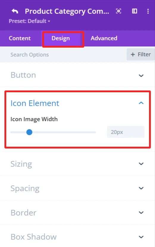
Design Tab: #
Icon Element:
You can customize the icon width.
6. Divider #
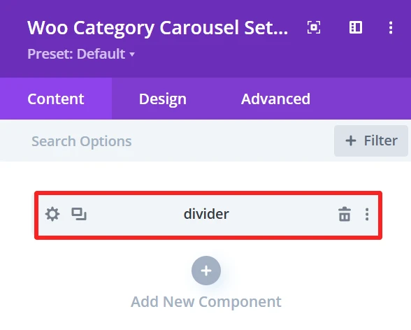
Purpose: Used to add a simple dividing line between items inside the category carousel.
Content Tab: #
Divider Line Height:
It has a slider (set to 3px). You can use this to set the thickness of the divider that delimits items in the category carousel.
Design Tab: #
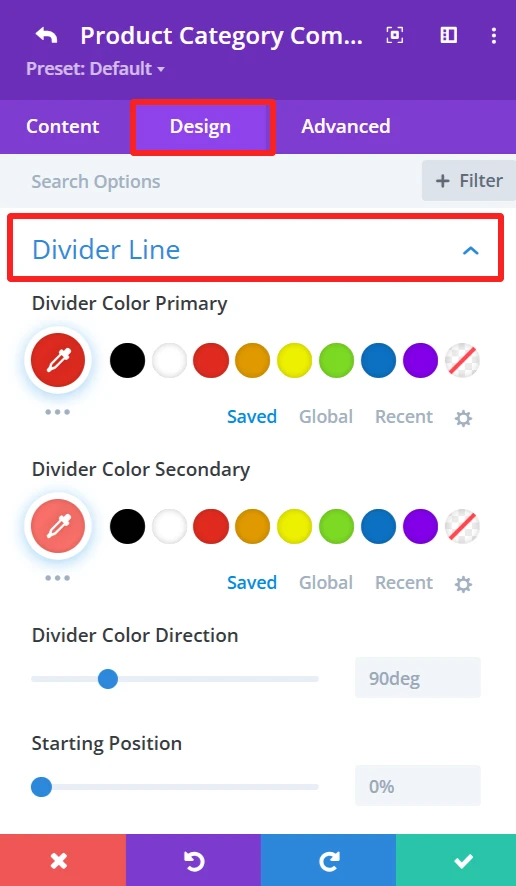
Divider Line:
Offers options for the divider line color and style, such as divider color direction, starting point, etc.
Global Features Of Woo Category Carousel Settings #
Content Tab – Woo Category Carousel Settings #
The content tab in the Woo category carousel has a handful of customization options that allow you to specify how the WooCommerce product categories appear in the carousel. You will get options to configure how many categories there are, the layout you want, and how the categories will be organized or filtered, and many more.
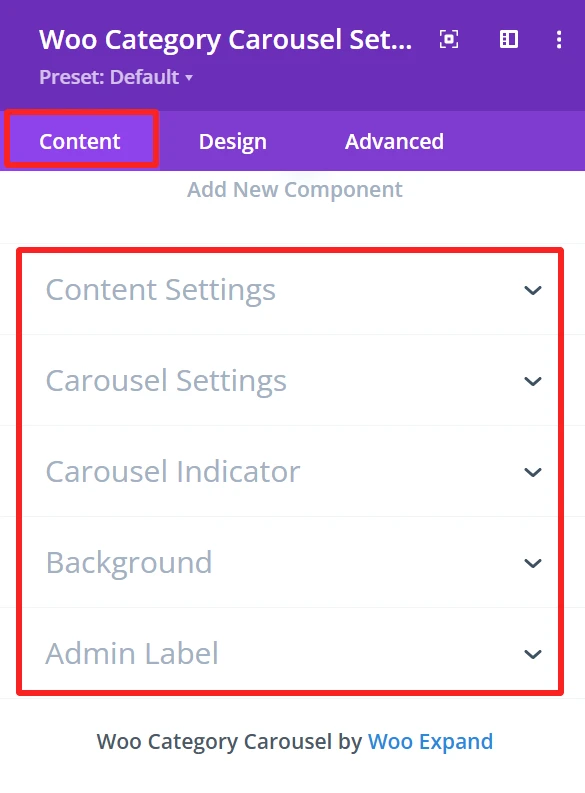
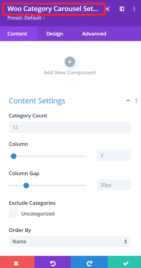
Content Settings #
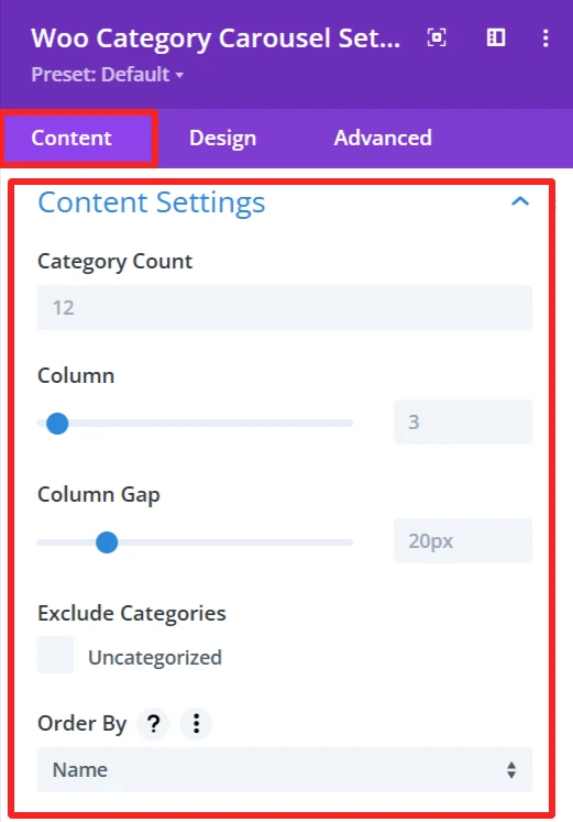
Category Count:
This option sets the number of categories to display in the carousel. You can put in a number here (ie, 12) based on how many categories you want to display to your site visitors.
Column:
The Column option enables you to select a number of columns for the carousel. You can choose from different numbers using the slider (3 Columns, 4 Columns, etc.) to change the overall layout of the carousel.
Column Gap:
Column Gap Toggles the Gap between the columns in the carousel. The gap between categories is adjustable by an input-slider (for example, 20px), allowing you to play with the visual density of your layout or spacing between category items.
Exclude Categories:
This feature is for when you want to exclude specific categories from the carousel. E.g., you can omit the Uncategorized category or any category as you want.
Order By:
The Order By choice is how you want the categories to be sorted in the carousel. You can select name, count, or slug to sort categories.
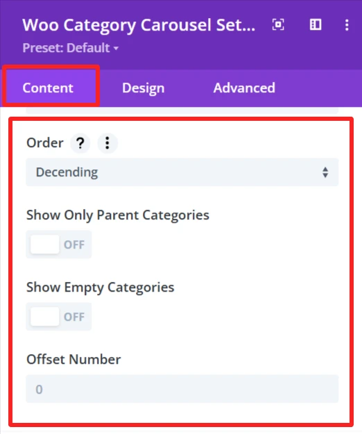
Order:
Allows you to specify if the categories should be sorted in ascending or descending order.
Show Only Parent Categories:
This toggle is a way to display only Parent Categories and omit any subcategories. When enabled, you will only see the main level categories in the carousel.
Show Empty Categories:
This setting controls whether empty categories are shown on the carousel. If you activate this option, empty categories will be displayed.
Offset Number:
The Offset Number option allows you to skip a defined number of categories from the beginning of the carousel. For instance, when you input 2, it will hide the first two categories, and the carousel will begin from the 3rd category.
Carousel Settings #
Carousel Settings In the WooCommerce Category Carousel module, manage the way the category carousel works and able to set the configuration for it.
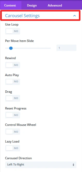
Use Loop: If you want the carousel to play in a loop, make sure to select ‘YES’.
Per Move Item Slide: This option adjusts the number of items to be scrolled per navigation in the carousel. For instance, if set to 1 then it will move a single item in one cycle.
Rewind: If ‘YES’, this feature lets a carousel go back to the beginning once the user reaches the last product.
Auto Play: Activate this option to have the category carousel start automatically, without the visitor having to do anything , and having the categories pass just by themselves.
Drag: If ‘YES’, it allows the user to swipe the category carousel items manually by dragging the mouse or touchpad.
Reset Progress: With this setting, your category carousel will be reset after the carousel finishes the category list and start again from the first category.
Control Mouse Wheel: Note that it is also possible to scroll the categories in the carousel using your mouse wheel, providing an alternate means of navigating through the pagination.
Lazy Load: This option can increase the page load speed by loading the visible category carousel items first. Scrolldown, and new items automatically come in.Carousel Direction: Here, you can specify the direction of the carousel. You can go to the left or right, it depends on which category you want to display when the slides are transitioning.
Carousel Indicator #
The Carousel Indicator section in the Content tab of the WooCommerce Category Carousel module gives you a handful of options on making the navigation and interactivity of your carousel look better.
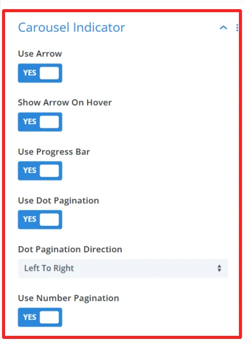
Use Arrow : This controls the arrow navigation on the carousel. If it is ‘YES’, you can press the arrow to go to the slide after or before the current slide in the category carousel.
Show Arrow On Hover: The navigation arrows display only when a user hovers over the category carousel. If ‘YES’, it keeps the design clean by default and shows the arrows just when they are needed.
Use Progress Bar: If ‘YES’, it shows a progress bar that indicates how far a user has gone through the carousel’s content.
Use Dot Pagination: Enable this to use dot pagination, meaning that dots (bullets) will be displayed to indicate where in the category carousel you are. When you click a dot, the user will be navigated to that slide.
Dot Pagination Direction – This will let you select the direction where the dots will appear. It allows you to choose whether to paginate your box left to right or right to left, according to your design.Use Number Pagination – When ‘YES’, numeric pagination is added, showing the number of the current slide and the total number of slides, which can be used to navigate to a specific slide.
Background #
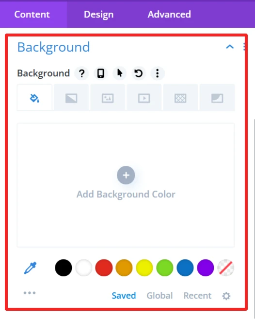
Customize the background display of the WooCommerce category carousel by setting a background color, image, or style. It allows you to customize the carousel design so that it fits on your website and matches your site’s look.
Admin Label #
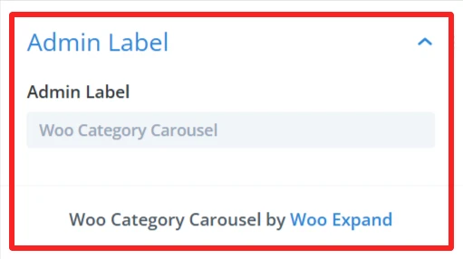
The Admin Label is good for locating/managing the category carousel in the WordPress admin panel. Administrators/developerscan find/grab the carousel component faster than other elements
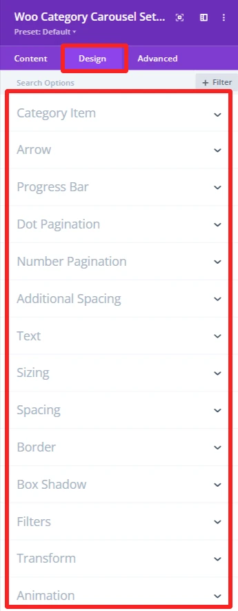
Design Tab – Woo Category Carousel Settings #
The Design tab in the Woo Category Carousel module lets you customize how the category carousel appears on your site. You can adjust the look and feel of the carousel and its items.
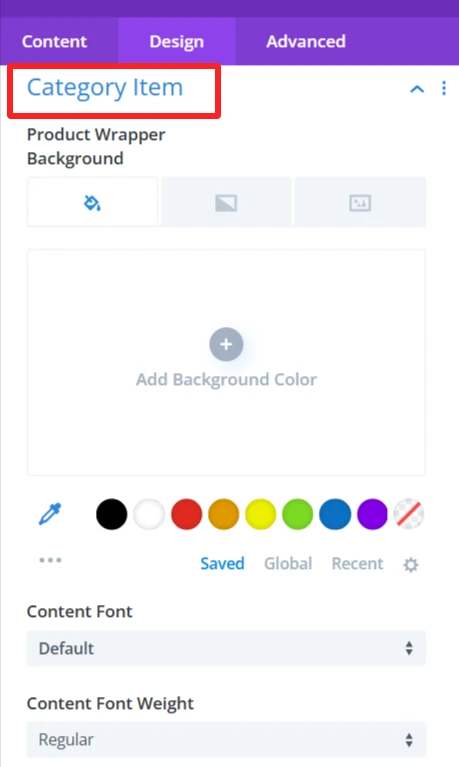
Category Item: #
Allows customization of the appearances of individual category items, such as wrapper background, font, weight, etc.
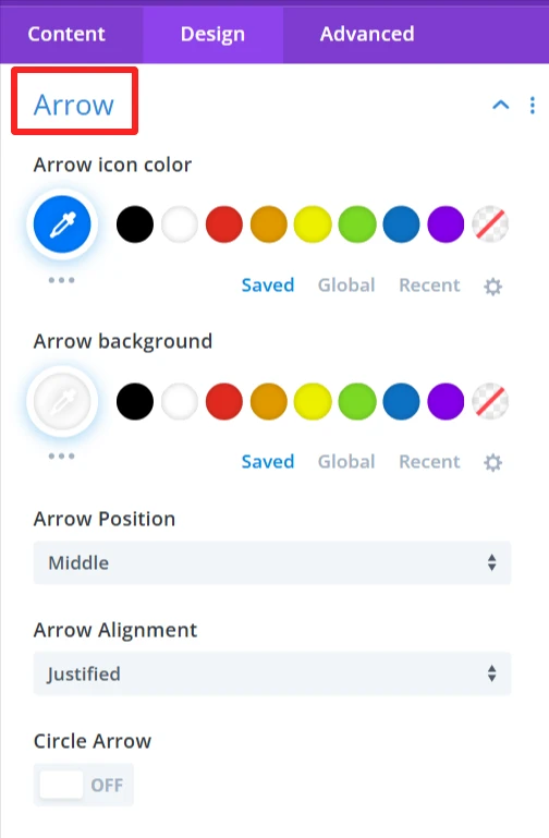
Arrow: #
Customize arrows, such as color, background, and positioning. Set alignment in the carousel and decide whether to show the arrows in a circle.
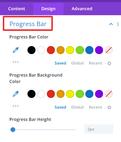
Progress Bar: #
Set the color, background, and height of the progress bar as per your design needs.
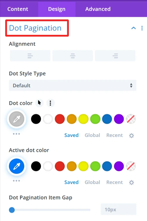
Dot Pagination: #
Customize dot pagination by alignment, dot type, and colors for active and inactive dots. You can specify the spacing between dots and also customize the dot size.
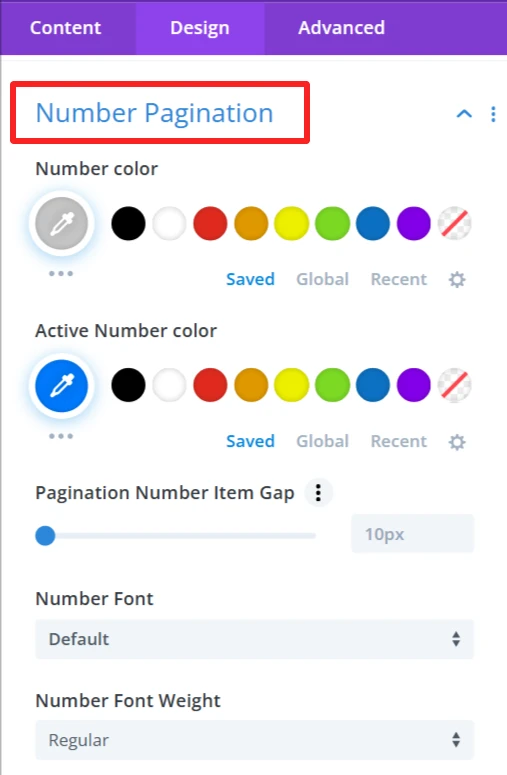
Number Pagination: #
Customize number color, change the active number color, set the spacing between pagination items, and select the font style and weight of the numbers.
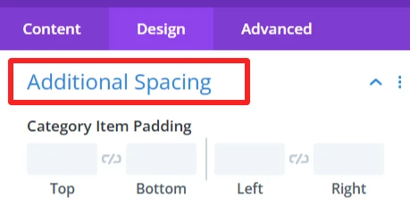
Additional Spacing: #
This is used to give full control of the padding in your category items, improving the look and balance of the category carousel.
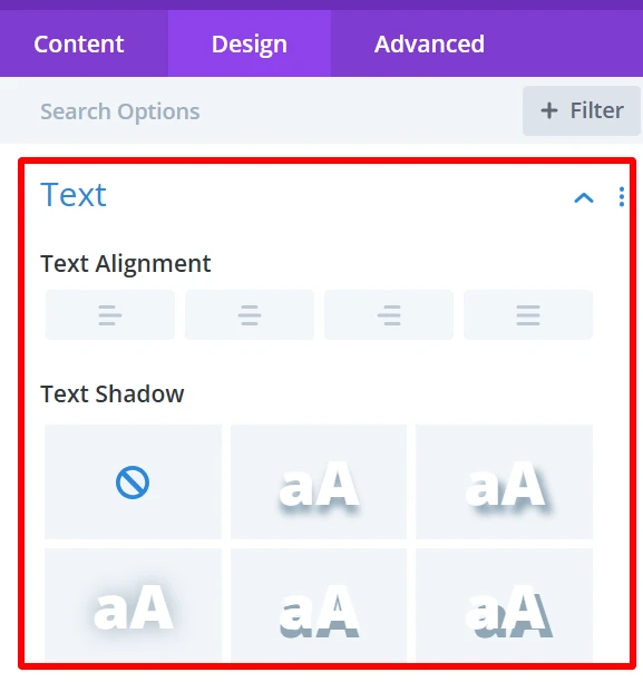
Text: #
It is used for customizing text alignment and text shadow within the category carousel.
Sizing: #
This is where you control the size of your entire category carousel and your category items. You can make the items display in the carousel as big or small as you want.
Spacing: #
Changes the distance between the category items. You can close in or spread the gap between categories for a tighter or more spread-out look.
Border: #
Add borders to the category carousel items.
Box Shadow: #
This option will add a shadow around the category carousel items that will provide some depth and distinguish them from the background. The shadow can have a blur, spread, color, and position of your preference.
Filters Effect: #
Hue, brightness, and opacity sliders to make the category carousel more appealing.
Transform: #
You can rotate and scale the category carousel items. This can be used to produce dynamic, interactive visual effects that will help your site feel more contemporary and engaging.
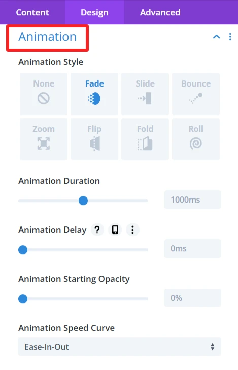
Animation: #
Intermittent animations when the user interacts with the category carousel. For instance, categories could fade in or slide in from the side when the page is loaded or when users hover over them.
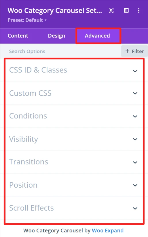
Advance Tab – Woo Category Carousel Settings #
The Advanced section of the Woo Category Carousel module offers more customization for those who’d like to have more control over the behaviour and visibility of the category carousel, as well as how the user will interact with it. These are mostly for those who know a bit of web development or who want to make fine-tuned adjustments. It offers options such as adding CSS IDs or classes, using its own custom CSS for design adjustments, and setting conditions for when the category carousel is displayed.