Divi WooCommerce Category Accordion Module is an easy to use and visually stunning module that displays your WooCommerce product categories in an accordion menu style. This is ideal for store owners who want to maintain a smooth browsing experience that is clutter-free, especially when working with numerous product categories or subcategories.
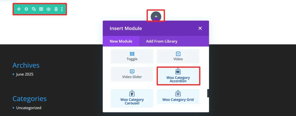
Adding the Category Accordion Module #
Add a New Section and Row
- Navigate to the visual builder of a page
- Tap the + (plus sign) to start a new section.
- Choose a Regular Section.
- Click the + within section to insert a row.
- Choose your column configuration (e.g., 1, 2).
Add the Category Accordion Module
- Select the gray + button on the row.
- Search for Category Accordion..
- Choose the Category Accordion Module.
- Set the Category Accordion Settings.
Child Components and Child Features #
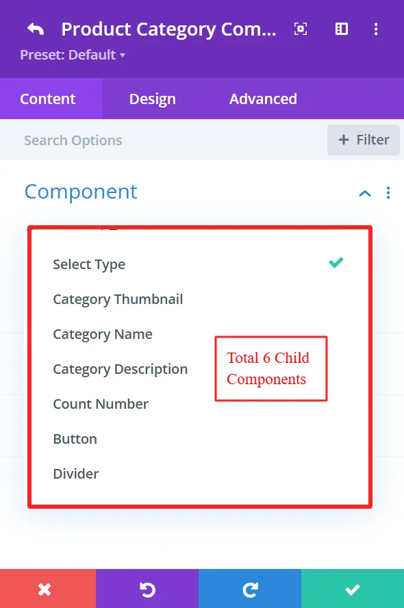
1. Category Thumbnail #
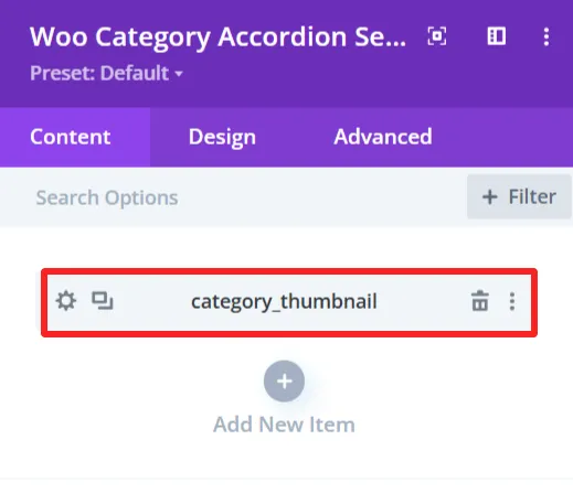
Purpose: Show the product category images as thumbnails.
Content Tab: #
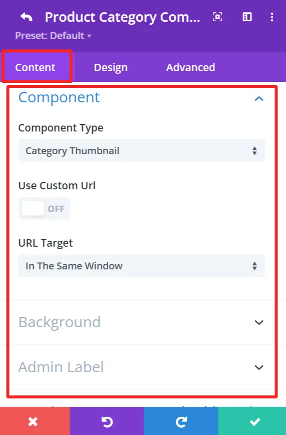
Component Type: This feature is available for each child component and works the same.
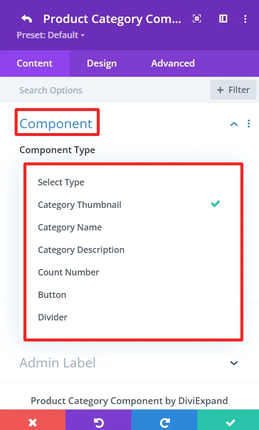
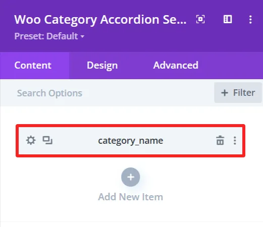
The “Component Type” dropdown prompts you to select the component to be the accordion item. You can select component type from the available options, including Category Thumbnail, Category name, Category description, etc.
Use Custom URL:
This feature lets you enter a custom category link. If checked, the URL will go to the supplied destination.
URL Target:
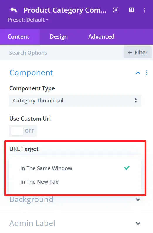
You can choose “In The Same Window” or “In The New Tab” as the URL Target. This is where the link will be opened upon clicking.
Background (This feature is available in the content tab of all child components and works the same.)
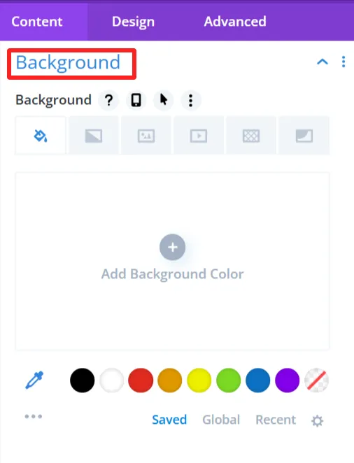
Here, you can choose the background settings of the category thumbnail, like the background color, background image, etc.
Admin Label (This feature is available in the content tab of all child components and works the same.)
With this, you can enter a custom label for your components, making it easy to label your layout if you are using more than one component.
Design Tab: #
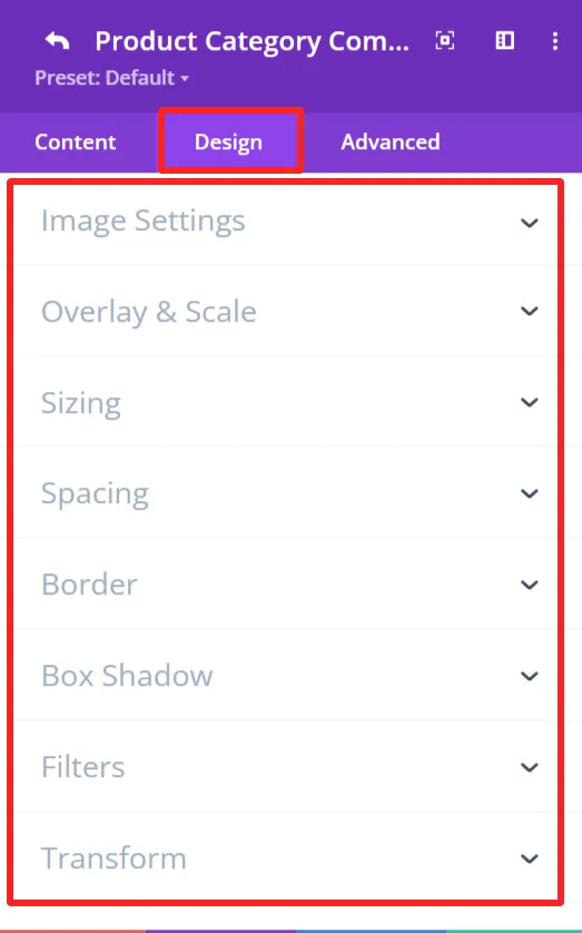
Image Settings:
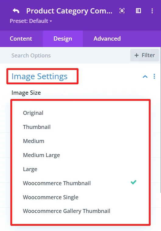
This section allows you to set how you would like your category image to be displayed. You have the option to specify the image size and other related settings to fit the thumbnail as you need.
Overlay & Scale:
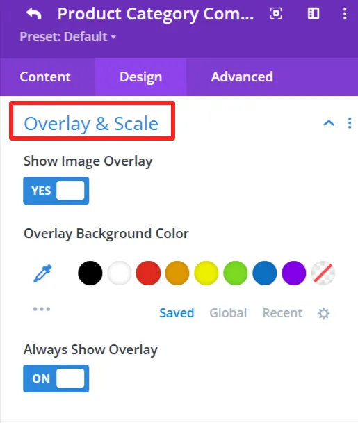
Modify the decoration that overlays the category thumbnail. You can also apply an overlay background color.
General Styling: #
These features are available for each child component and work the same.
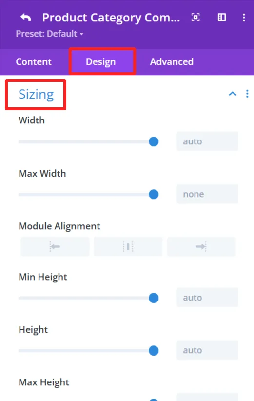
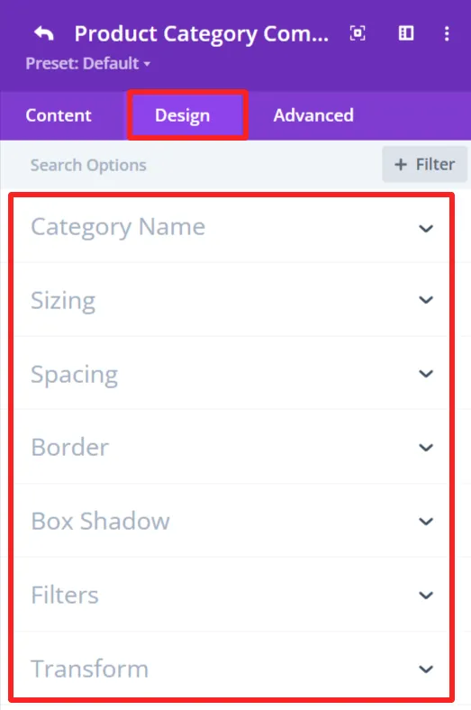
Sizing feature: Set width, height, and alignment.
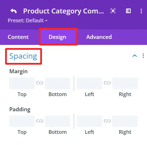
Spacing feature: Control Margin and padding system.
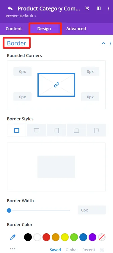
Border feature: Custom Border of the category accordion, like broader color, width, and styles, and rounded corners.
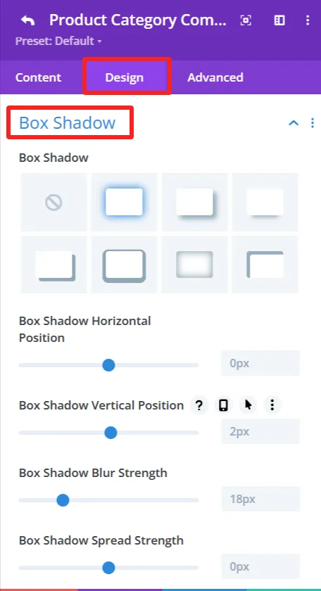
Box Shadow effects: Add shadow effects for depth.
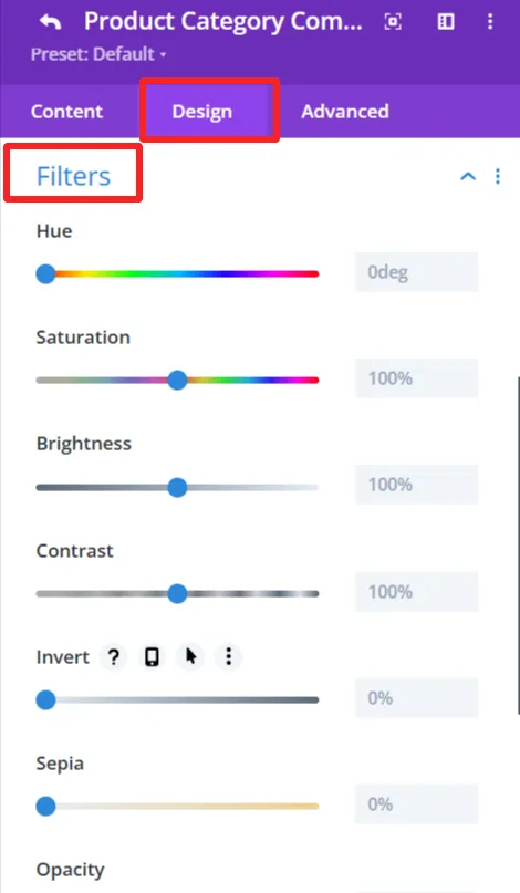
Filters feature: Apply filters like hue, brightness, and opacity sliders.
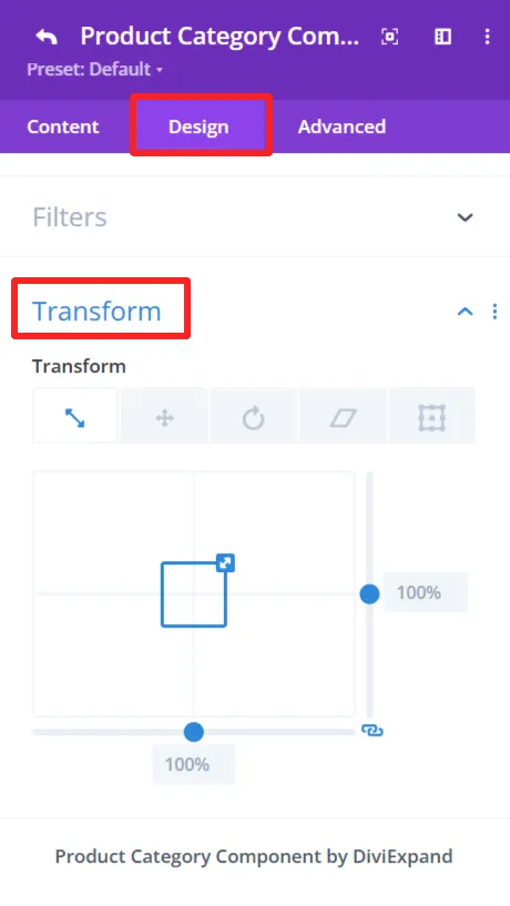
Transform feature: Use Transformations (scaling, rotation, etc.)for dynamic effects.
2. Category Name #
Purpose: Show the name of each of the product categories in the category accordion.
Content Tab: #
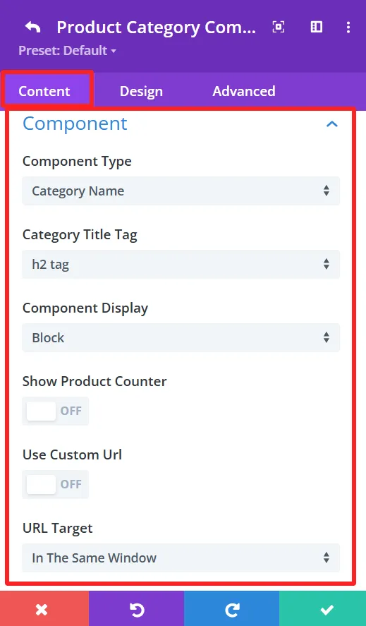
Category Title Tag:
This option allows you to select the HTML tag for the category name. Choices exist for tags such as h2, h3, or h4, which assist with all the Search Engine Optimization.
Component Display: (This feature is also available in the content tab of Counter Number and Button child components.)
You have control over the component view. It is Block by default, but you can change it to other display options (inline and inline block) according to what you want to achieve in design.
Show Product Counter:
This toggles the ability to display how many products are available within each category directly next to the category title. If disabled, only the category title is shown.
Design Tab: #
Category Name:
This gives you the option to style the category name, such as font size, colour, and weight.
3. Category Description #
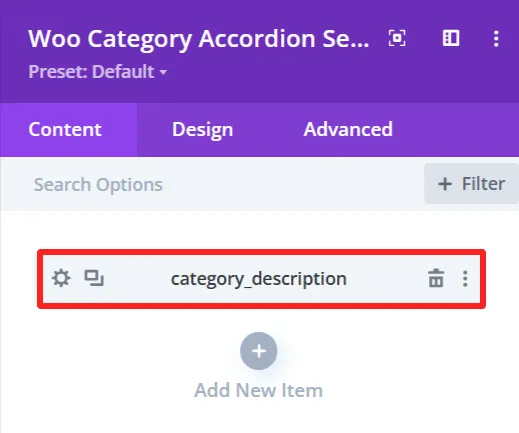
Purpose: Show the short description of each product category in the category accordion.
Content Tab: #
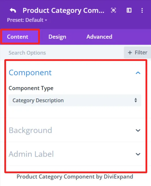
Design Tab: #
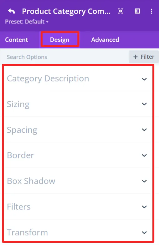
Category Description:
Set the typography options for the category description, such as font size, color, and weight.
4. Counter Number #
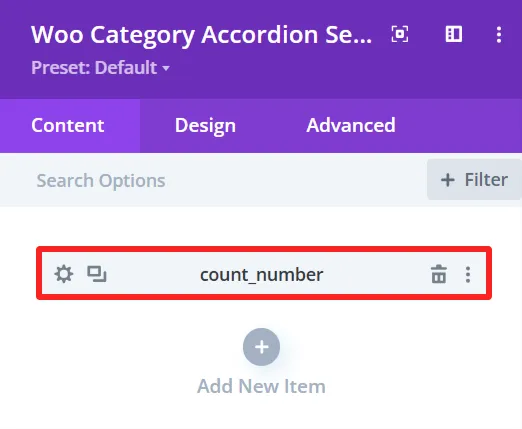
Purpose: Shows the count of products or items in a specific category.
Content Tab: #
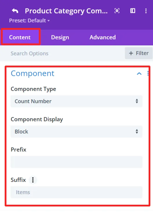
Prefix:
Here you can add a prefix to the counter number. Empty means no prefix is placed before the counter number.
Suffix:
The suffix is ‘Items’, which will appear after the counter number.
Design Tab: #
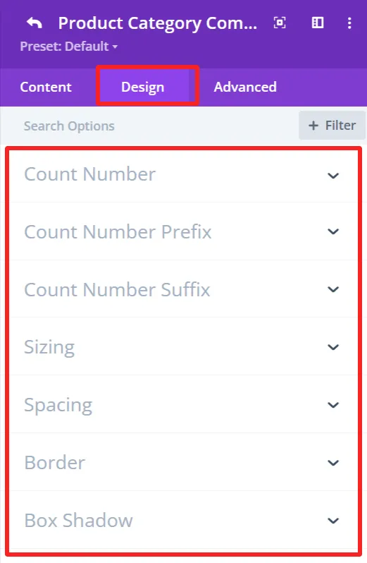
Count Number:
Customize the count number font size, weight, color, etc.
Count Number Prefix:
Formats the prefix design of the number, font size, weight, color, etc.
Count Number Suffix:
Customize the look for the suffix “Items”, font size, weight, color, etc.
5. Button #
Purpose: Add a customizable button to an accordion which can be linked to a page or a category.
Content Tab: #
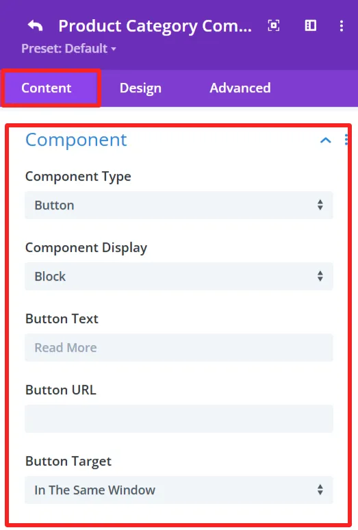
Component:
Button Text:
Determines the text to display in the button. Such as “Read More” or any Custom Text.
Button URL:
URL for the button to point to. This could be a link to a category, page, or other type of URL.
Button Target:
Select the button link target. Options include:
In The Same Window – Opens the link in the same tab.
“In The New Tab” – Opens the link in a new tab.
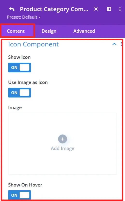
Icon Component:
Show Icon:
This option lets you choose whether or not you want an icon to appear alongside the category button.
Use Image As Icon:
This would allow you to use an image as the icon.
Image:
When you switch to “Use Image as Icon,” the “Add Image” button is displayed. Here you can upload the image, which will be as an icon.
Show On Hover:
The icon/image displays when the user hovers over the category button.
Design Tab: #
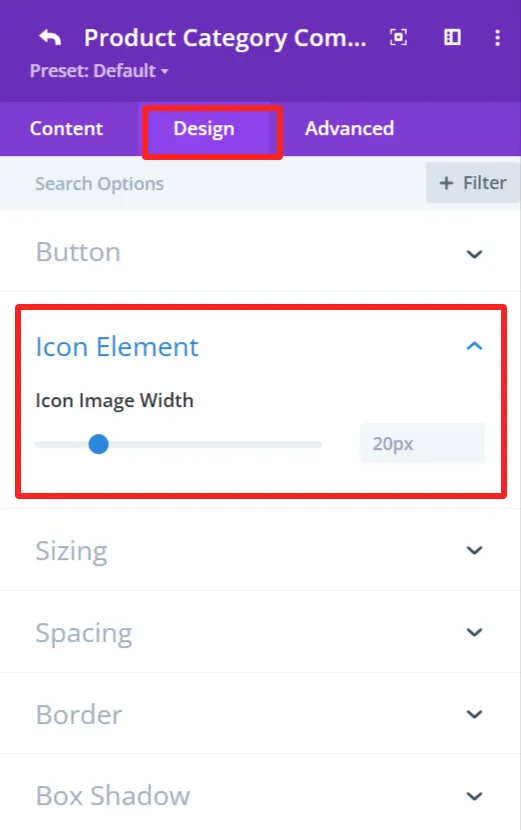
Icon Element:
You can customize the icon width.
6. Divider #
Purpose: Used to add a simple dividing line between items inside the category accordion.
Content Tab: #
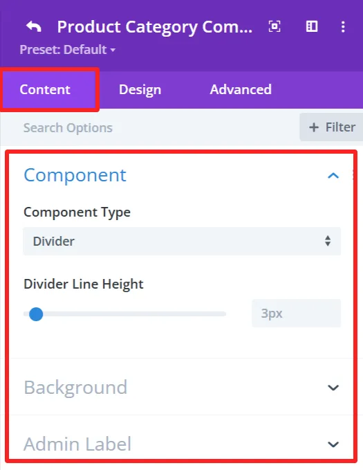
Divider Line Height:
It has a slider (set to 3px). You can use this to set the thickness of the divider that delimits items in the category accordion.
Design Tab: #
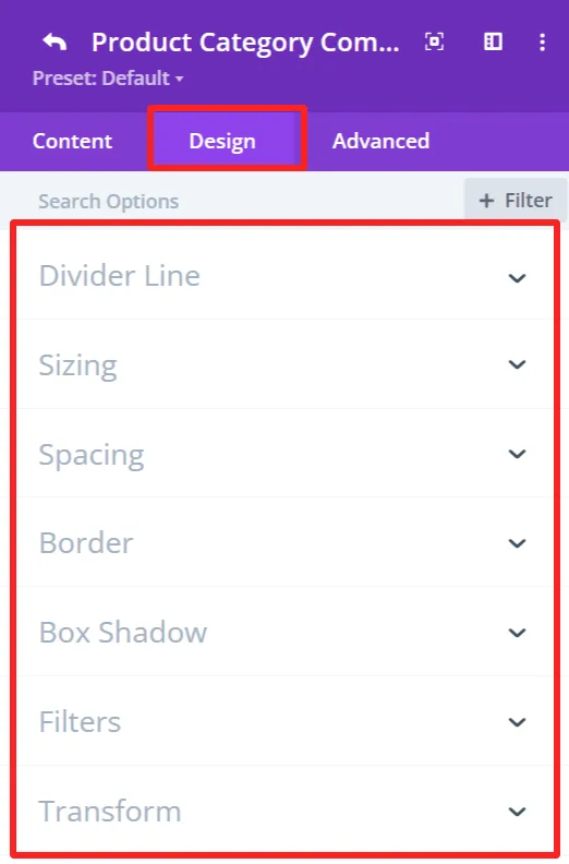
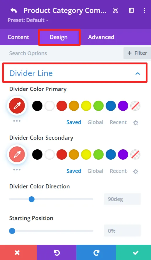
Divider Line:
Offers options for the divider line color and style, such as divider color direction, starting point, etc.
Global Features Of Woo Category Accordion Settings #
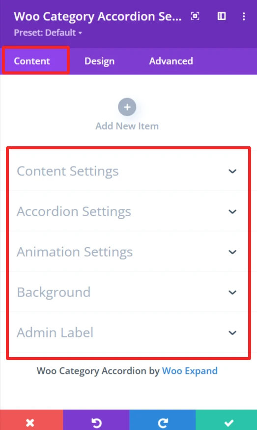
Content Tab – Woo Category Accordion Settings #
The content tab in the Woo category accordion has a handful of customization options that allow you to specify how the WooCommerce product categories appear in your accordion. You will get options to configure how many categories there are, the layout you want, and how the categories will be organized or filtered, and many more.
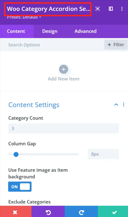
Content Settings #
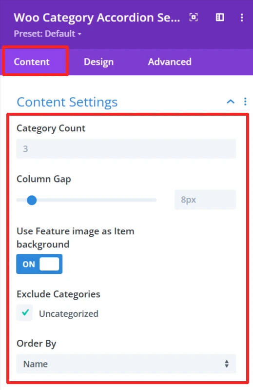
Category Count:
This option sets the number of categories to display in the accordion. You can put in a number here (ie, 3) based on how many categories you want to display to your site visitors.
Column Gap:
Column Gap Toggles the Gap between the columns in the accordion. The gap between categories is adjustable by an input-slider (for example, 8px), allowing you to play with the visual density of your layout or spacing between category items.
Use feature Image as Item Background:
If ‘On’, the Featured Image for each category will be utilized as the background image for each accordion item. This adds visual density in the categories.
Exclude Categories:
This feature is for when you want to exclude specific categories from the accordion. E.g., you can omit the Uncategorized category or any category as you want.
Order By:
The Order By choice is how you want the categories to be sorted in the accordion. You can select name, count, or slug to sort categories.
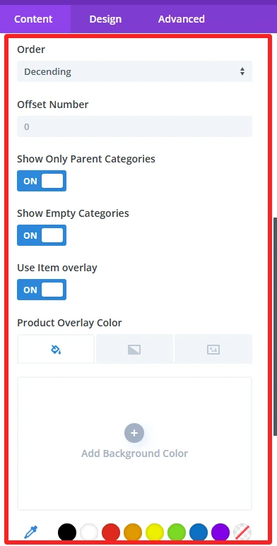
Order:
Allows you to specify if the categories should be sorted in ascending or descending order.
Offset Number:
The Offset Number option allows you to skip a defined number of categories from the beginning of the accordion. For instance, when you input 2, it will hide the first two categories, and the accordion will begin from the 3rd category.
Show Only Parent Categories:
This toggle is a way to display only Parent Categories and omit any subcategories. When enabled, you will only see the main level categories in the accordion.
Show Empty Categories:
This setting controls whether empty categories are shown on the accordion. If you activate this option, empty categories will be displayed.
Use Item Overly:
When enabled, it adds a semi-transparent overlay to each item in the accordion. Adds some visual effect that makes the category items stand out or appear to be more interactive.
Product Overlay Color: In this setting, you can select a color for the overlay effect of the category items.
Accordion Settings #
Accordion settings effortlessly customize and make the product category accordion on your WooCommerce shop look as you see fit, in a way that provides design freedom without compromising functionality.

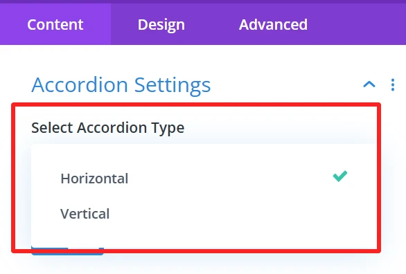
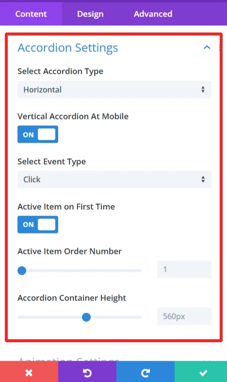
Select Accordion Type: Here you have the possibility to decide between two types of accordion display: Horizontal and Vertical. Horizontal places the accordion items next to each other, while Vertical is a stack of one on top of the other.
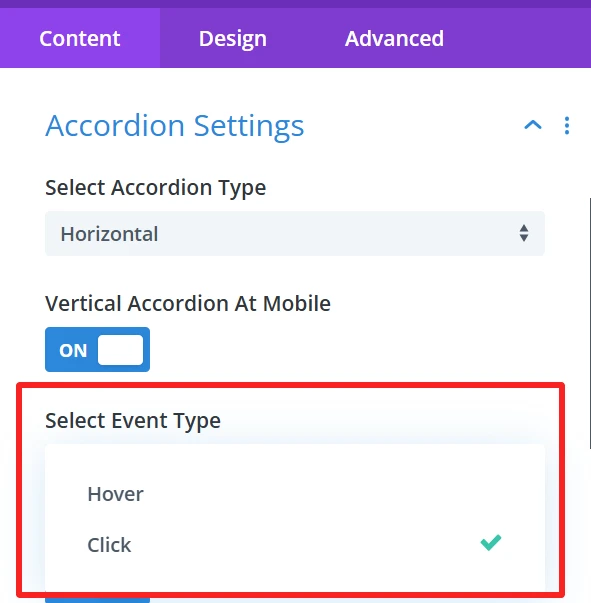
Vertical Accordion at Mobile: This makes the accordions vertically on mobile, works perfect on small screens. When clicked it triggers accordion to change into mobile version, which is easier for navigation.
Select Event Type: This one allows you to set how the accordion items will be opened. You can select event type, hover, or click.
Hover: The item will open when the user hovers over it with the mouse.
Click: The user will click on the item to open it.
Active Item on First Time: This option is activated by default, it means that one accordion item will be opened automatically while the page is loading. This visually helps users by displaying an active item before they have to do anything on the accordion.
Active Item Order Number: This option allows you to select the accordion item which will open when the page loads for the first time
Accordion Container Height: You can set the height of the accordion container with this option. You can set up the height( in pixels) to tweak how the accordion fits into your design. This keeps the accordion container consistently presented.
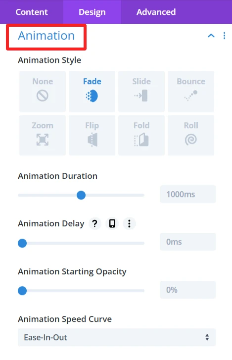
Animation Settings #
With these animation options, you can customize the user journey to suite your needs and ultimately deliver a more delightful and engaging WooCommerce product category accordion. There are a bunch of effects that you can choose from depending of your website design and so on.
Enable Animation: This option will let you enable or disable the animation. If activated, the accordion content will be animated as the user interacts with the accordion.
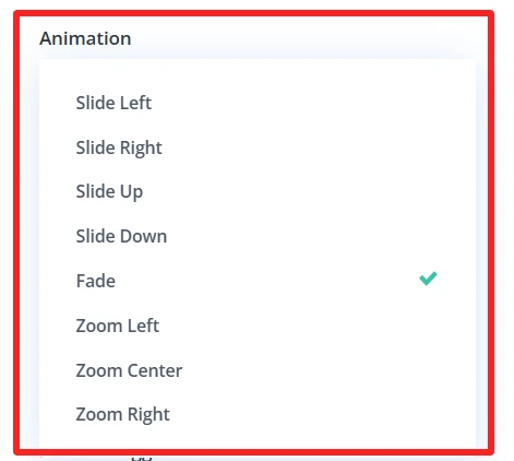
Animation: This contains many animation effects. You can select from the dropdown:
Slide Left: Slides the content to be displayed from the left.
Slide Right: The content slides in from the right.
Slide Up: The content appears to slide up from the bottom.
Slide Down: The content slides into down.
Fade: The content gradually fades in.
Zoom Left: The content will zoom from the left.
Center Zoom: The content zooms to the center.
Zoom Right: The content zooms from the right.
Duration (ms): The speed slider controls the length in milliseconds of the animation. Use a longer time here to slow down the animation, and a shorter time to speed it up.
Delay (ms): This slider specifies the delay to wait before starting the animation (in msecs). You can modify this so that it gives the illusion of a timed effect between multiple accordion ctegories.
Animation Timing Function: The Timing function is the speed curve of the animation.
Enable Stagger: If activated, each accordion item animates with a delay between them instead of all at once.
Stagger: This slider controls the delay between the beginning of each item’s animation, to give a more staggered/controlled ‘one by one’ effect.
Background #
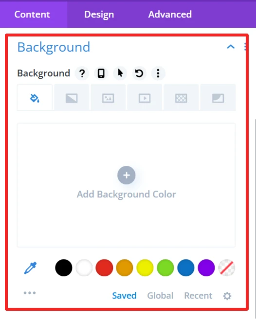
Customize the background display of the WooCommerce category accordion by setting a background color, image or style. It allows you to customize the accordion design so that it fits on your website and matches your site’s look.
Admin Label #
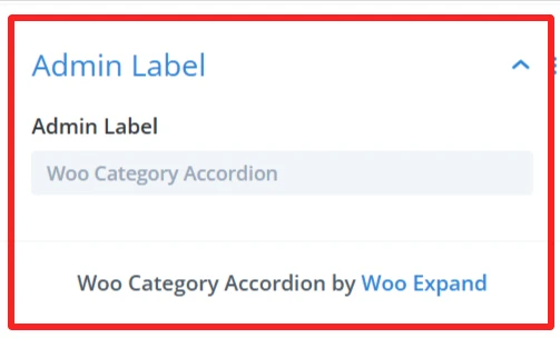
The Admin Label is suitable for locating/managing the category accordion in the WordPress admin panel. Administrators/developers can find/grab the accordion component faster than other elements
Design Tab – Woo Category Accordion Settings #
The Design tab in the Woo Category Accordion module lets you customize how the category accordion appears on your site. You can adjust the look and feel of the accordion and its items.
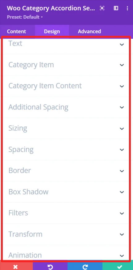
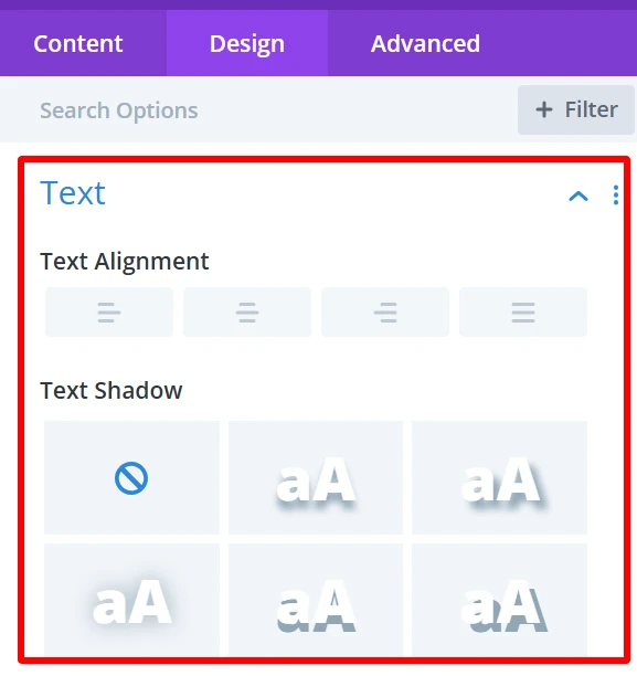
Text: It is used for customizing text alignment and text shadow within the category accordion.
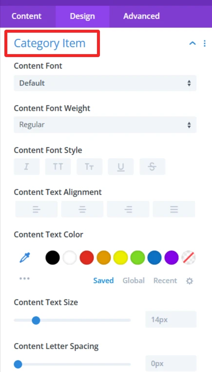
Category Item: Allows customization of the appearances of individual category items, Such as content font, weight, style, etc.
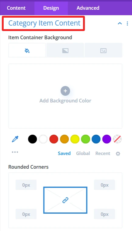
Category Item Content: It is used for customization item container background, rounded corners, and its border style, width, color also used to give a box shadow in the item container.
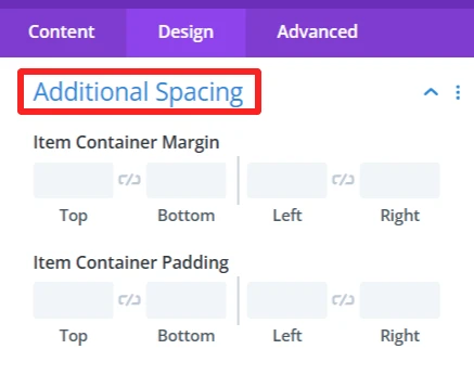
Additional Spacing: This is used to give full control of the margin and padding in your item container. which improves the look and balance of the category accordion.
Sizing: This is where you control the size of your entire category accordion and your category items. You can make the items display in the accordion as big or small as you want.
Spacing: Changes the distance between the category items. You can close in or spread the gap between categories for a tighter or more spread-out look.
Border: Add borders to the category accordion items.
Box Shadow: This option will add a shadow around the category accordion items that will provide some depth and distinguish them from the background. The shadow can have a blur, spread, color, and position of your preference.
Filters Effect: Hue, brightness, and opacity sliders to make the category accordion more appealing.
Transform: You can rotate and scale the category accordion items. This can be used to produce dynamic, interactive visual effects that will help your site feel more contemporary and engaging.
Animation: Intermittent animations when the user interacts with the category accordion. For instance, categories could fade in or slide in from the side when the page is loaded or when users hover over them.
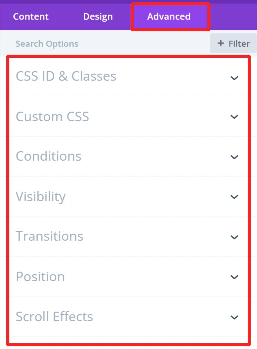
Advance Tab – Woo Category Accordion Settings #
The Advanced section of the Woo Category Accordion module offers more customization for those who’d like to have more control over the behaviour and visibility of the category accordion, as well as how the user will interact with it. These are mostly for those who know a bit of web development or who want to make fine-tuned adjustments. It offers options such as adding CSS IDs or classes, using its own custom CSS for design adjustments, and setting conditions for when the category accordion is displayed.