

Introduction
Instead of overwhelming users with too many product details upfront, a product accordion module allows customers to expand and view details on click — creating a clean, user-friendly shopping experience.
Since Divi does not come with a native product accordion module for WooCommerce, but with WooExpand’s Product Accordion Module, you can add this feature directly inside Divi without custom code.
Why Use a Product Accordion in your Divi Store?
- Keeps pages organized and clutter-free
- Improves readability and navigation
- Reduces scrolling and creates engaging interactions
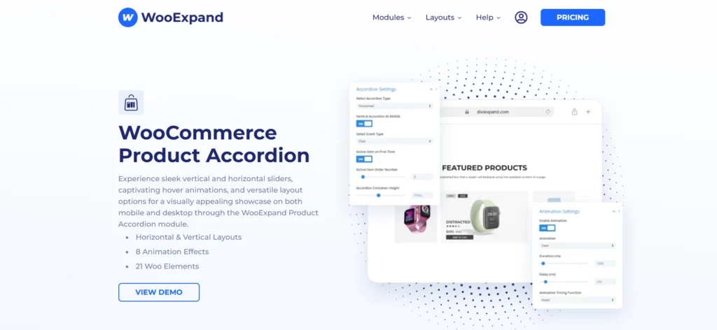
WooExpand’s Product Accordion module
Unlike generic plugins, WooExpand’s Product Accordion:
- Built for Divi → No shortcode hassle, fully visual editing
- Lightweight & Fast → Optimized for speed
- Modular → Only load what you need
- Full Styling Control → Customize every element in the Divi Builder
How to Use the Product Accordion Module
Step 1 – Install & Activate WooExpand
- Get WooExpand from the pricing page
- Simply upload the plugin in your WordPress dashboard and activate it.
- Enter your Licence Key & enable modules.
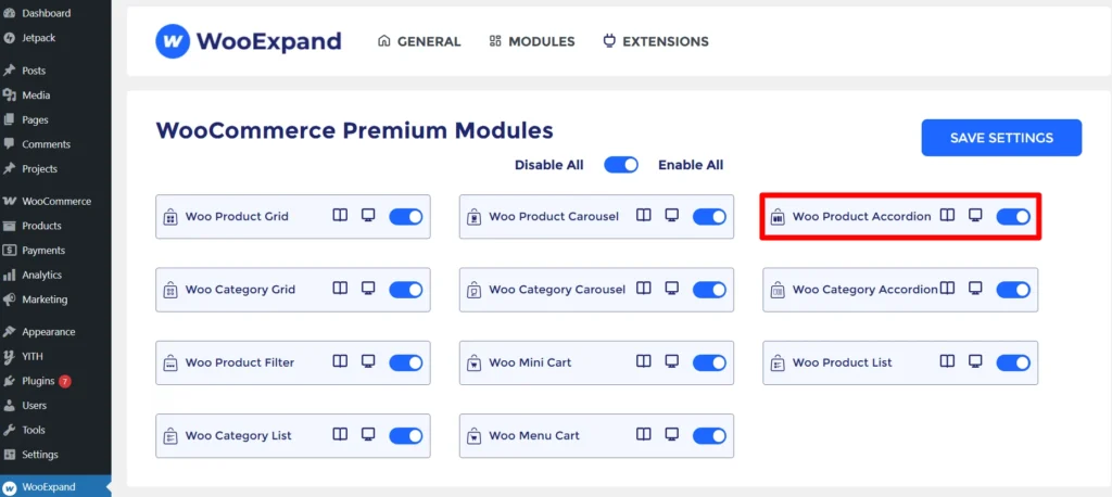
Step 2 – Enabled the Product Accordion Module
- Go to the dashboard of your WordPress
- Check if the Product Accordion Module is enabled or not from the WooExpand settings.
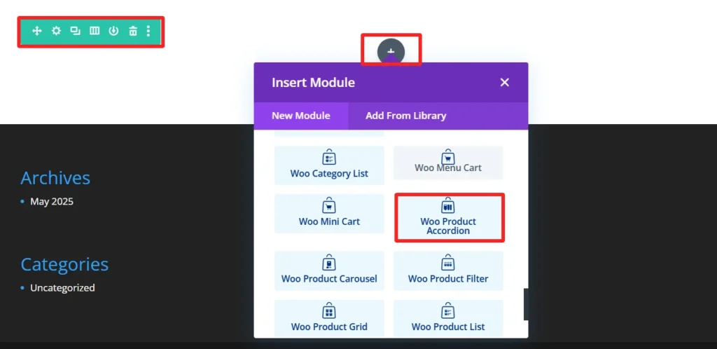
Step 3: Open the Divi Builder
- Create or edit a page
- Add a WooExpand Product Accordion Module
Step 4: Configure Your Accordion
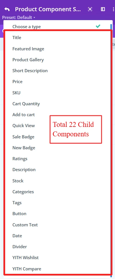
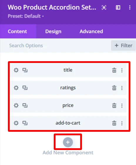
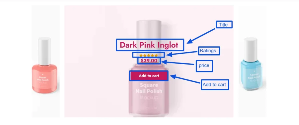
1 Select Product Source: WooExpand has a total of 22 child elements for the product accordion module. You can select any of your preferred child elements from here.
2. You can add child elements using the + icon. As here, these four child elements are added to create a demo design.
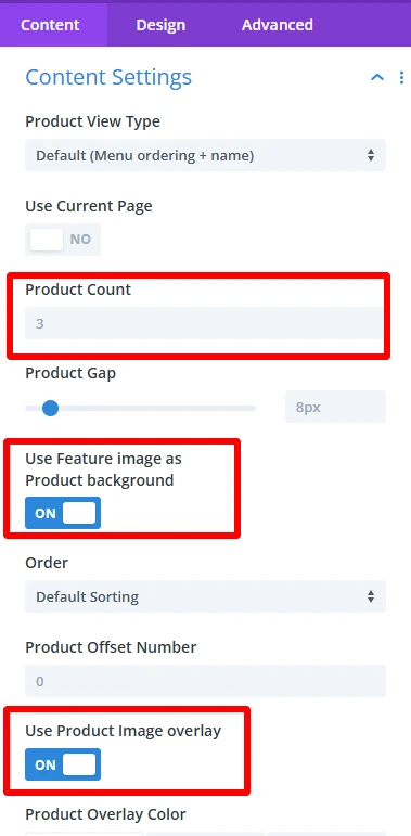
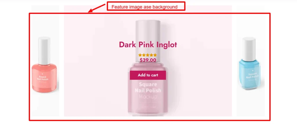
3. From the Content Settings, you can set the product view type, product count, use feature image as background, and many more options.
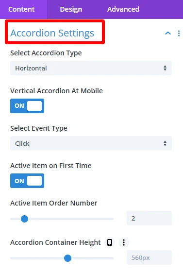
4. Accordion Settings make the product accordion on your WooCommerce shop look as you see fit, in a way that provides design freedom without compromising functionality.
- Select Accordion Type: Choose between Horizontal or Vertical display for the accordion.
- Vertical Accordion at Mobile: Ensures the accordion displays vertically on mobile devices.
- Select Event Type: Choose how the accordion items will open, either by hover or click.
- Active Item on First Time: Automatically opens one accordion item when the page loads.
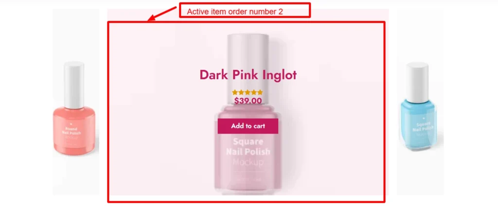
- Active Item Order Number: Specifies which accordion item will be opened by default when the page first loads.
- Accordion Container Height: Sets a fixed height for the accordion container in pixels, ensuring consistent presentation in the design.
Demo design for active item order number 2.
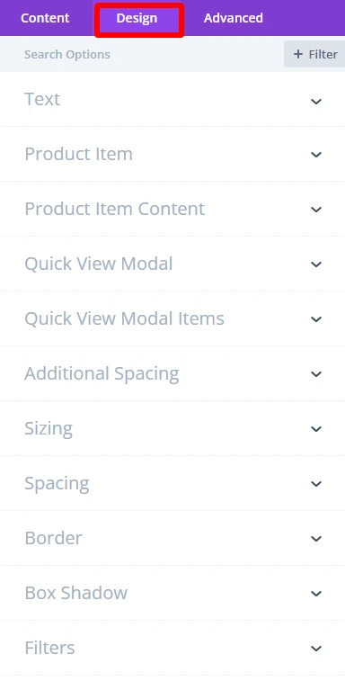
Step 5: Experience Design with Divi-Controls
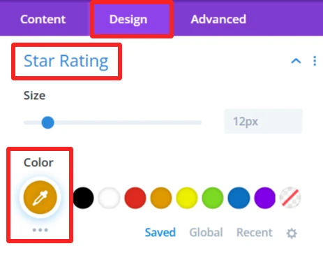
- Easily change spacing, typography, colors, etc, from the design panel.
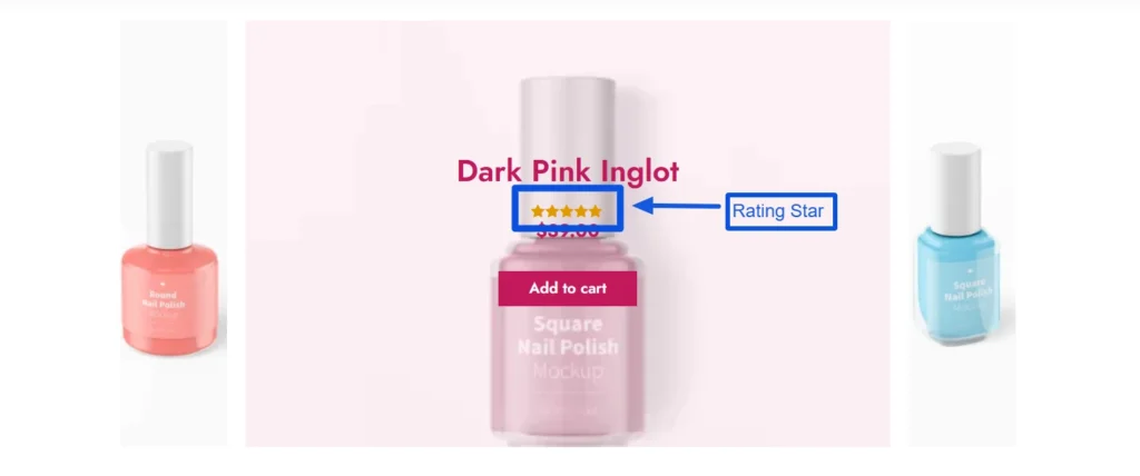
As you can see, the color of the ratings child component was changed using the design tab of this component.
- For more information about these features, you can visit WooExpand’s documentation about Product Accordion.
Step 6: Preview and Publish
- Preview the accordion desktop View and mobile View
- When you are satisfied with the design, publish your page and go live
Demo & Styling Inspiration
Do you want to see what it looks like before you try?
👉 View the Live Demo Here — Discover accordion variations.
👉 Learn How to Import Demo
Conclusion
The Product Accordion Module is perfect for creating interactive and user-friendly product pages. Combined with WooExpand, it provides a visual design experience — no coding required.
- See Live Demo
- Get WooExpand Now — Lifetime License Available!


0 Comments